The Evolution of Photography for Television

I’ve never seen Hill Street Blues. During the first years it aired I didn’t own a television. When I finally did, I tried, but the labyrinth plots and the huge cast of unknown characters seemed more of a nuisance than an invitation, and I passed on the opportunity.

A few years later when the show’s stepchild NYPD Blue came around the situation was different. I still had a TV, and also a wife with taste. She began following the series, and I began following her example. The adventures of Andy Sipowicz and his colleagues were the Muzak of our lives until the show ended its run in 2005. We loved it, and when we cut the cable and began getting TV off streaming last year, we decided to revisit the adventure. We’re currently up to Season 8. It’s worth rewatching, in my humble opinion.

So I began wondering if that earlier Steven Bochco brainchild Hill Street Blues might give us similar pleasures. Unlike me, Lisa did watch Hill Street on its original run, but she was game. We couldn’t find it anyplace for free, and we’re not quite curious enough to pay money for it. But I did check into YouTube to see what they had. There are quite a few full episodes available there, in indifferent image quality, but free nonetheless. I gave it a whack.

HILL1.png

Weirdly enough, I found myself unwilling to give it even an hour of my life. I had more important things to do, and more seductive ways of entertaining myself. I was a while realizing what it was that immediately so disappointed me in the 1980s series.

I never saw St. Elsewhere or L.A. Law or Bay City Blues or even Cop Rock. But NYPD Blue had made a Bochco fan out of me, and yet for some reason this early series was immediately unwatchable. When I realized what it was that bothered me, it touched on a point which may possibly apply to other areas of the arts, and which also may shed some light on the relationship between evolving technology and the creative process. But please. I invite those who do know something about this stuff — and I am thinking of tough and insightful critics such as New York film critic Michael Sargent; the brilliantly articulate Arlen Schumer; perennially good-hearted curmudgeon James Romberger; legendary comics editor Scott Allie, whose understanding of TV production enabled him to turn filmed features into great comic books; my sister Madeleine Robins, who has spent six decades explaining to me practically everything that I know, and much that I do not yet know, and whose dozen published novels and scores of short stories certainly qualify her as a world-class authority on storytelling; and especially my Emmy-winning brother-in-law Danny Caccavo, no stranger to the ins and outs of post-production for television — to chime in here, and if necessary, tear what follows to shreds. You guys are smart, and I’d like to get smarter.

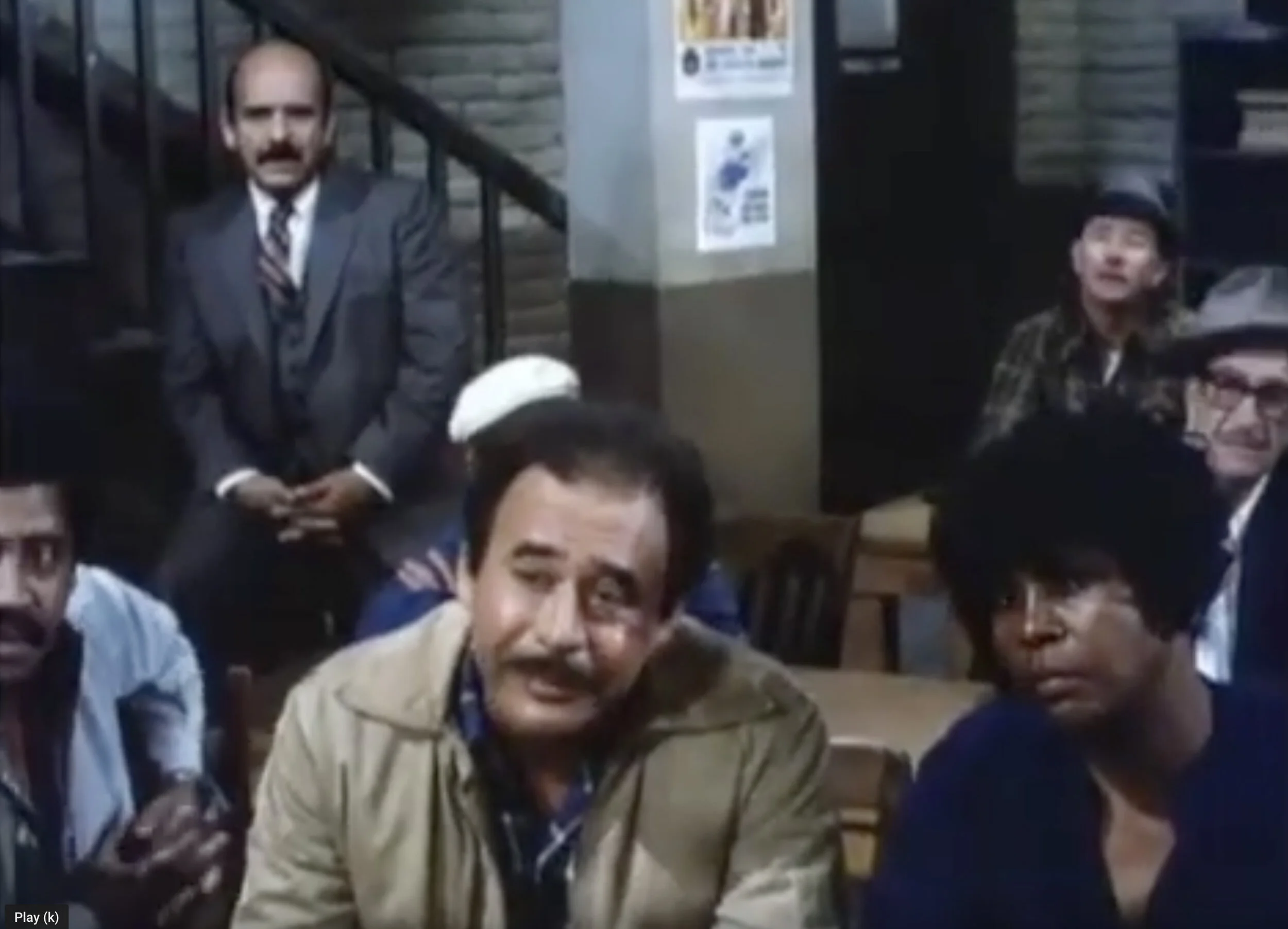
What bothered me about Hill Street Blues was its cinematography. Take another peek.

HILL1.png

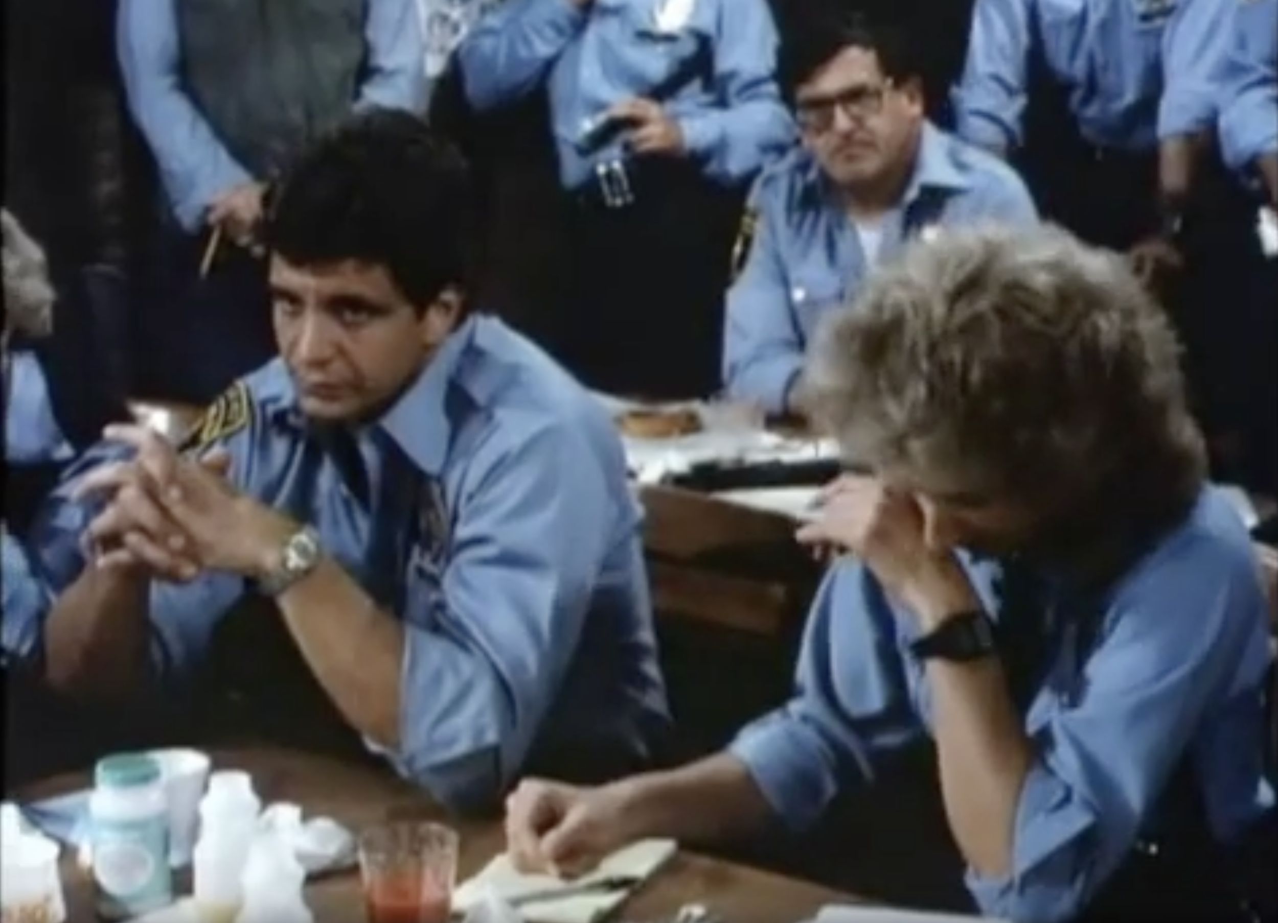
The lighting here is absurdly bright and clean. It could have been an episode of The Mary Tyler Moore Show or Rowan and Martin’s Laugh-In. Comedy lighting. It was not invented for television, but it was pervasive in television. The low-resolution screens didn’t allow for much in the way of elliptical imagery; everything had to be crystal clear. Insiders called it “The Aaron Spelling Look,” because that sort of sharp-focus, brightly lit photography hit its apotheosis in the nighttime soaps Spelling churned out in the 1980s. Spelling himself went on record that he didn’t absolutely want there to be no shadows or nothing ever out of focus, but he said he spent a great deal of money constructing and dressing the sets for his shows, and he damn well wanted all of that to appear on screen. The above image is not quite so clean and clear, but it also could not be mistaken for a real police station, or a real anything, except a real sound stage.

A decade and some change later, the cinematographic landscape had changed a bit, and show runner Bochco came forth with his 1990s answer to the cop show.

NYPD2.jpg

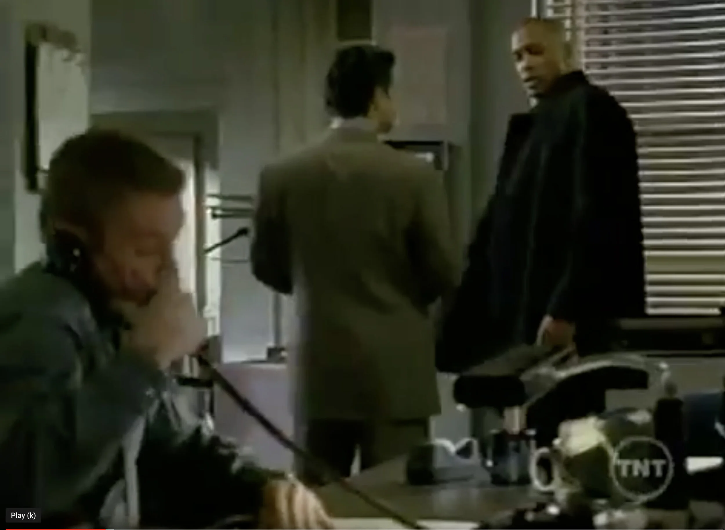
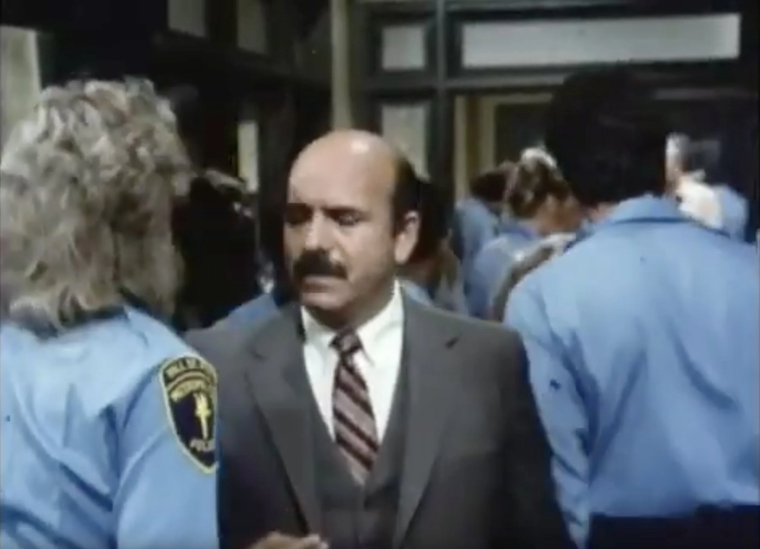
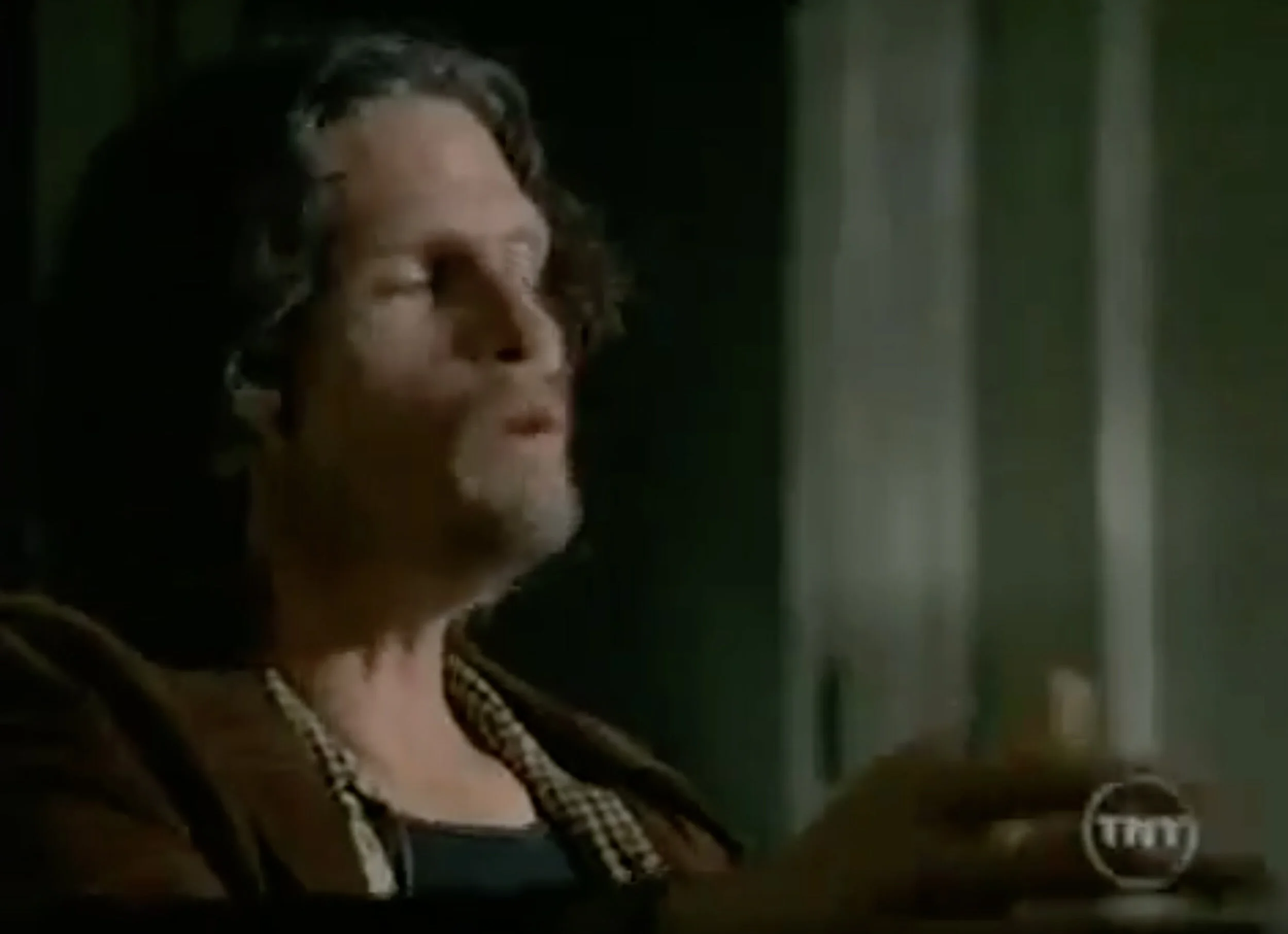
On NYPD Blue, the light was subdued, made to look accidental. Obviously it wasn’t; the series interiors, like those of its predecessors, were played on sound stages, with lights mounted on catwalks far above the false walls. Perhaps in a few years an image like this will look as ridiculous to the eye as the previous one, shot forty years ago. But it was this change in the style of cinematography that made Hill Street a hard sell to me; it purported to be realistic, but every image screamed fakery.

HILL2.jpg

Look at the highlight on the man’s head on Hill Street. Look at the pool of light that surrounds him. There’s nothing accidental about this, although perhaps it looked that way for its time.

miami.jpg

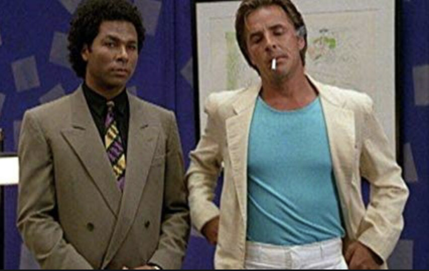
You know, maybe I missed the chance to try out my visual prejudices and suspension of disbelief on Hill Street, but I was definitely around for the above specimen of eighties culture, and I adored it. But criminies, find me lighting like that anyplace outside of a movie studio and I’ll sell you the Tamiami Trail.

Does this mean that Hill Street’s Director of Photography William Cronajer or Miami Vice’s Dion Beebe were just formulaic hacks? Absolutely not. The color palette of the former seemed bent on the color blue; the latter made earth colors pariah. This was serious stuff for episodic television. The imagery in both shows was innovative and exciting. Without actually sitting through a few episodes of Hill Street, which I would like to do, I will stipulate that the visual styles of both shows well served the storytelling, which is all that photography should aim to do.

But there’s no getting around the verisimilitude absent in the 80s shows, and far more fully realized in the 90s Bochco series. This was not solely a matter of the decade: the lighting in episodic TV in the 1990s, for the most part, far more closely resembled that of the 60s and 70s than what we saw in NYPD Blue. So the question remains, how did Steven Bochco obtain a look in the later show that escaped him completely in the earlier show, and also escaped the producers of most other episodic TV of the 1990s? There are several reasons that are clear to me. Danny, Madeleine, Mike, James, Arlen, Scott, maybe you can add a few more to what follows, or debunk what I say here. Please jump in.

One difference was Steven Bochco’s comparative track record in the earlier and later periods. By the 1990s he was a proven commodity, and surely had more sway with the networks over what would get on screen. If this meant a grimmer palette and uneven lighting on the sets, Bochco got what he wanted, along with the legendary, and silly, nude scenes.

But maybe the biggest difference was the change in the image quality possible on a TV screen. NYPD debuted quite some years before digital television was standardized, but the writing was on the wall, and Bochco must have realized that the sort of surreal clarity demanded in TV cinematography was about to go out with the horse and buggy. With the kind of detail and vividness about to be possible on the plasma screen, perhaps he felt that a lot of that vividness could be sacrificed for the sake of storytelling, of ambiance, of mood.

It’s certainly not like Stephen Bochco invented realistic film lighting in 1993. You can take that one back to the 1920s if you want, or even earlier. Closer to home, the sort of naturalistic lighting attempted on NYPD Blue was absolutely nailed a quarter century earlier, when Owen Roizman shot The French Connection on interior and exterior locations in New York, using very little artificial light, and capturing the heartbeat of Manhattan in a way no one had ever done before. But Bochco’s contribution was to bring this sort of thing to the small screen, perhaps in anticipation that the new viewing media would allow more and more playfulness, and less and less spelling things out.

NYPD3.jpg

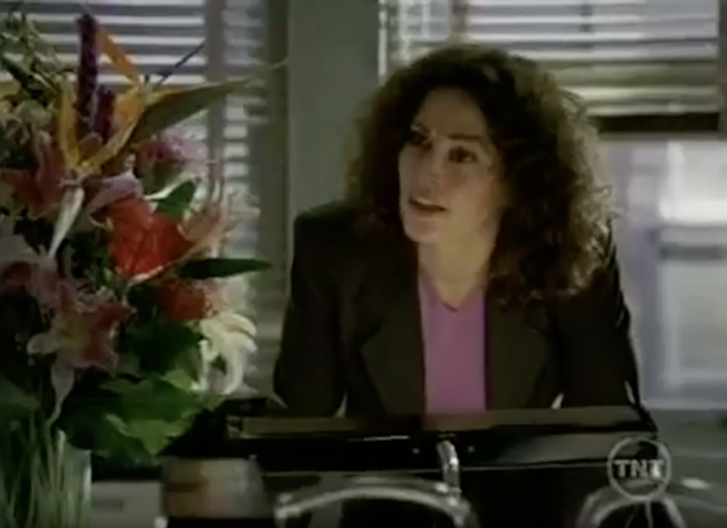
This is the sort of image Joan Crawford or Bette Davis might destroy a cameraman’s career over. I’ve never worked in film, but I’ve heard stories. (Arlen? Mike? Madeleine? Danny? Scott? James? Am I blowing smoke here?) A strong leading lady could get a director of photography fired for a shot like this. Actresses were supposed to look terrific in every shot, every frame, even at the cost of the story. Bochco didn't get the memo? Or was storytelling the priority, the altar upon which all other concerns were sacrificed? Kim Delaney’s career didn’t collapse over this image. At 58 she’s still getting work. Maybe some of this was because she trusted the producers who hired the cameramen?

NYPD1.jpg

Is this literal reality? No, but it’s a far closer suggestion than Bochco could get away with in the 80s, and I would submit that much of the reason for this was that TVs, even before it all went digital, could spell things out more clearly to begin with. So why not lose some edges and allow a little more chiaroscuro than was permitted a few years before?

NYPD6.jpg

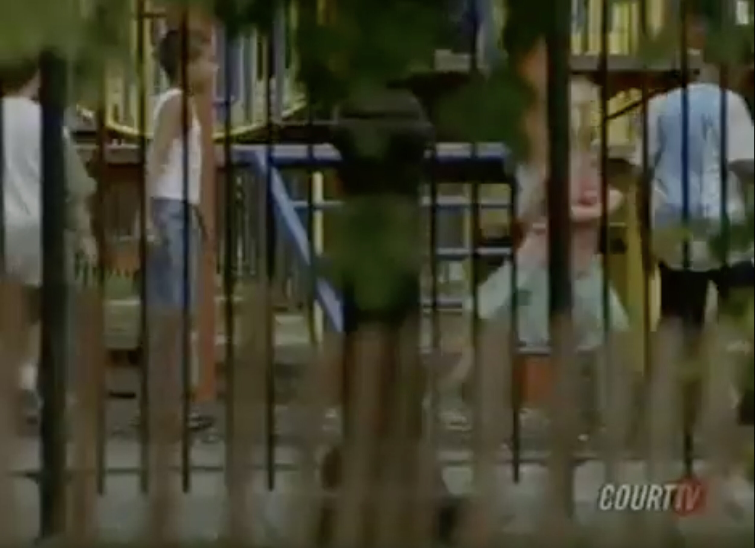
There’s another possible reason for NYPD’s grittier visual style. In order to produce the sensation of New York City on a series mostly shot in Burbank, they shot a lot of footage of NYC street scenes, and mixed it in with the exteriors filmed on Warner’s backlot. A visual style had to be devised for which both the generic street footage and the backlot stuff, as well as the sound stage interiors, would work nicely together. The answer seemed to be to key everything to the generic footage. It was all shot in a style evoking the sensation of what were essentially home movies, done with a sense of carelessness on the streets of Manhattan, on 35mm film.

HILL3.jpg

I do not presume to pass any judgment whatsoever on Hill Street Blues. I am only saying that as one used to the later product, I was surprised and disappointed by the earlier, probably unjustly. I’ll give it another chance. What I am suggesting is that cinematography is an extremely powerful element of storytelling, and so much so that it made what was probably a very real and honest comment on the human condition look passé to me, for no good reason except that I did not own a TV in the early 1980s.

And if you happen to make your living shooting motion pictures, you surely don’t need me to remind you that nothing is more important than telling the story. Absolutely nothing.

Oh. One more thing…

ambient light.jpg

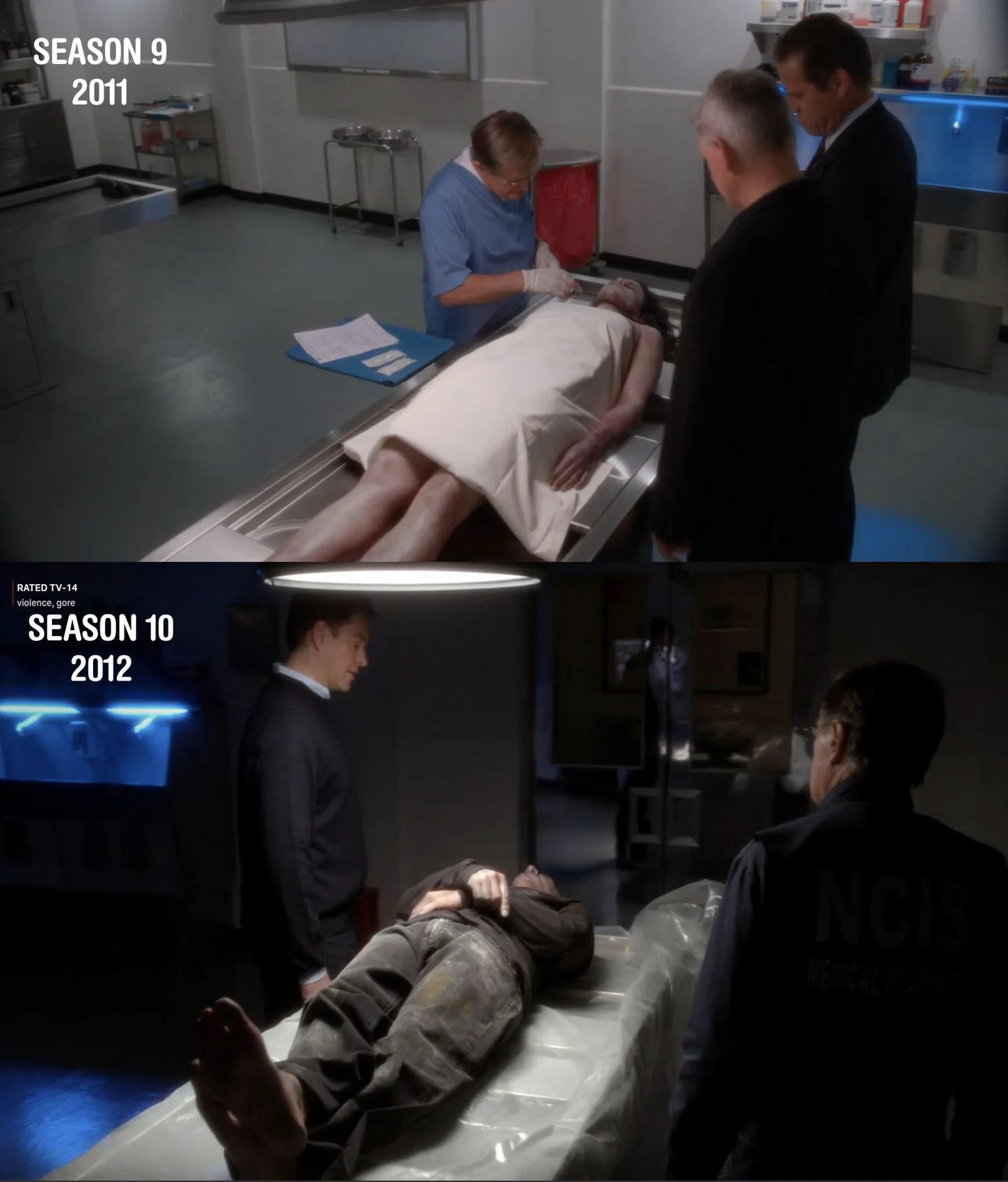
In the comments below, Marcus Adams points out that this sort of uber-natural lighting can be taken a bit too far, and he cites the change in the visual style between the 9th and 10th seasons of NCIS. Above is the image he used as a case in point.

A Star is Born

Last year I spent three days on the picture below, only to abandon it after realizing that I couldn’t make it any better. Its big problem was that it began as a picture about the ground plane and ended up a picture about the sky. And, unfortunately, neither ground nor sky thrilled me much.

19_06_2018_day3.jpg

The question “What is the picture about?” never bugged me as much in past years as it does lately, perhaps because until recent years I was struggling to just get a readable image onto the canvas, whether or not it held any kind of pictorial unity. But the 2018 picture just wasn’t sure what it was about. This wasn’t for lack of planning on my part. I made sketches, I revised them, and I went at the canvas with what I thought was a coherent plan. Yet while it’s good to make plans, it’s even better to make good plans, and one may not be able to tell the difference between good plans and poor ones without actually beginning to translate them into paint. This one was lousy breaking out of the gate, and it resisted every effort I made to make it better. It happens. It’s no fun, but it happens.

Short of a composition that thrilled me, I was subject to the vagaries of the light and atmosphere of the three days I spent painting the picture. The first two days the sky was clear and bland, and I focused on the ground. The third day the sky was cloudy and swirling and dynamic, and I repainted the sky to suit. Suddenly the picture’s raison d’être became muddled. You can find my blog post, “The Fine Art of Upstaging” if you care. At the time I concluded that the sky upstaged the picture on day three, and that this was just fine, that it’s nice to be ready to improvise. That’s fine, except the picture sat in the attic for a year, and I couldn’t stand the sight of it.

Last Friday, I spent the afternoon scouting for paintable vistas, and wound up at McGlasson’s Fruit Stand in Hebron, KY, a place where I’ve spent many hours and many failed canvases over the years. I love the place, but I’d never managed to find a motif there around which a satisfying picture could be built. I hadn’t tried going there for several years. But it’s October, McGlasson’s sells an awful lot of pumpkins, and I’ve always thought an October scene at McGlasson’s could be a scaffolding upon which a comment about the changing seasons might be built. I blogged about this a few days ago, but I’ll go back over it now.

10_18_2019_sketch2.jpg

This is a pencil sketch of what I thought might work as a composition. I’m standing so far back that any people who might wander into the view were bound to be very small. The whole concept of pumpkins was likely to be either entirely invisible or very understated. What it was, however, was a fruit stand underneath an October sky. There is more gestalt in one October sky than can be found in many acres of pumpkins.

The little note I made to myself reflected this. “Stratus Clouds” are the wispy, somewhat nondescript clouds that characterize every season except summer. They’re easier to paint than cumulus or cirrus clouds, and the Friday sky was overhung with stratus clouds. Maybe I wasn’t thinking critically enough; stratus clouds aren’t nearly as interesting visually as cirrus or cumulus. Maybe a sky-dominated picture should have had a more elegant rack of clouds. But that was my decision. I had a cheap 8x10” cotton canvas panel, and I thought I’d try sketching the scene in color.

10_18_2019_sketch3.jpg

So there it was, my plan for a fruit stand under the October sky. The little black dots surrounded by yellow are dying sunflowers. The reddish passage on the left were pumpkins. I wasn’t sure exactly how I would go about painting the field of sunflowers, but this was my forty-minute rumination on the scene, and I decided that it had passed the audition.

The following afternoon I returned, and found something entirely different wafting over my motif.

cirrus1.jpg

Cirrus clouds. I don’t know what makes ‘em tick, or why they’re seldom found in summer skies. If I remember my meteorology, they’re much higher in the atmosphere than cumulus clouds, and instead of water vapor, they’re composed of ice crystals. (If I’m mangling this, please speak up.) Why they are so characteristic of everything but summer, I have no clue. Stratus clouds tell a similar story of the end of summer and warmth, but they’re nowhere near as thrilling to the eye as their cirrus cousins. I took this picture earlier on Saturday, while watching my granddaughters playing soccer. But the sky show went on and on into the afternoon.

cirrus2.jpg

Here’s how they looked when I got to McGlasson’s that afternoon. And suddenly that rather uninteresting Friday sky had been replaced, like the aging diva in All About Eve, with its understudy. Suddenly my picture had a star.

10_19_2019_day1.jpg

So I went at the 16x20” canvas with considerable gusto, wanting little more than to record this magnificent rack of ice-crystal clouds. The lay-in took about an hour. Lisa and I had a dinner engagement that night, and she called me to ask if we could accommodate our guests’ schedule by showing up a half hour earlier than we’d anticipated. This worked to my advantage. Had I spent another half hour on this thing, I might have noodled with it too much.

10_19_2019_day2.jpg

This afternoon I was able to make it back to the scene. The incredible cloudscape was long gone, but between what I’d managed to grab three days earlier and the snapshot reproduced above, I was able to finish the sky. With what lay before me, I could describe the ground plane.

That ground plane isn’t as finished as I would have liked, but looking at it now, several hours later, I am forced to conclude that this is a good thing. A picture can be about damn near anything, but it dare not ever be about two things at once. A clearly drawn ground plane would have competed against the iconic fall cloudscape. Clearly, this was not a picture of a fruit stand with clouds above. It was about clouds hanging over a fruit stand. Specifically the sort of clouds that signal the end of warmth and the onset of winter’s desolation.

The changing of the seasons is a story I yearn to tell. I think it is a story upon which all human beings thrive. Life is a merry-go-round, not a conveyor belt. All of us, aware of our own mortality, crave the cycle of the seasons. If the Lord tarries and death will someday stalk us, at least every twelve months we still get to see desolation overtake the world around us, and then we get to see it all reborn. It’s a simple reality which speaks to us all, and it’s the essence of the story which every landscape painter seeks to tell: life, death, and rebirth. In the telling of that story, this rack of clouds took center stage and became the star.

Oh, one more thing. I had no stretched canvas upon which to paint this scene. I took that 2018 picture, the one whose star never really took center stage, and painted over it. The late Richard Lack counseled that every painter must be his own curator. I agree. In two sessions, I managed to tell the story of McGlasson’s Fruit Stand under the cold October sky, bring some unity to the motif by allowing that sky to take center stage, and was able to hide forever my 2018 failed picture under this new image.

Groping for a Motif

There’s a wonderful family-owned vegetable stand in Hebron, Kentucky. I’ve wanted to paint it for, easily, the past fifteen years, and I’ve still got a dozen canvases done there that have all crashed and burned. I particularly hanker to do something there as Halloween approaches every year, because the place does a huge trade in pumpkins. The setting and the time of year, for all the splashy color, have a sense of melancholy. The sun is setting. Frost is coming. The merry-go-round is taking us into winter’s desolation.

I tried yet again this afternoon. They know me there, and have even allowed me to roam the place past the end of October, when the stand closes to the public. So I wandered around. In the past, I’ve tried to do something kinda Rockwell. This time I tried to put stories and associations out of my thinking. I walked around until I happened on an arrangement that seemed like a picture could be built around.

10_18_2019_sketch1.jpg

A couple of hundred feet from the place, the view seemed pleasant enough. You can’t see it in this pencil sketch, but the receding perspective lines aim towards a line of pumpkins in the middle distance. It looked pretty good to me, but I’d left no room in the sketch for the sky, and I wanted to crop the picture accurately. So I tried again.

10_18_2019_sketch2.jpg

It seemed promising. It is interesting how the puffy cumulus clouds of summer disappear almost immediately when fall sets in. The first weeks of October the weather’s been unseasonably hot and bright. Last week it broke, abruptly. Today it warmed up again, and supposedly will stay that way. But the clouds are no longer summery. You’ll see that in a minute. Any meteorologists in the audience? Can someone explain to me why cumulus clouds disappear and Stratus clouds dominate the fall and winter sky?

I still liked the arrangement, so I figured I’d give color a try. I had a cheap 8x10” panel, with cotton canvas mounted thereon.

10_18_2019_sketch3.jpg

Forty minutes was enough to get a sense of the color I was dealing with. I still think the setup’s promising.

10+18+2019_setup.jpg

There is a desperation in fall scenes like this, at least there is when I paint them. I’m not as able to withstand severe cold as I once was, so every bright, warm fall day could well be the last one till spring. At least normal bright warm days. There are bright, warm days to be found in every November, as well as most Decembers and Januaries. But you always pay a price for such days. They may be warm and bright, but there’s usually some kind of weird accompanying phenomenon. Usually it’s crazy wind. I love October. You get it while you can.

I’ll be back tomorrow. We’ll see what happens.

One Method For Painting Cloudscapes

A lot of people ask me how I go about painting sky sketches. Well, that’s not entirely true. One person once asked me. So now, by popular demand, I will describe the process, at least as I currently do it. The method may change entirely once I learn more.

motif2.jpg

The sky does marvelous things. It reminds me of pouring a double shot of cream into a cup of hot coffee. The two liquids gradually mix in a series of patterns which are a lot like what clouds do, and this is not accidental. Cream is cold, coffee is hot, and the two liquids waltz around each other in much the same way that cool air and warm air do, thus producing the movement we see in the sky.

This particular scene interested me because at the lower right, the clouds and the distant hills onto which they were pouring rain became one; the outline of the hills was lost. You can’t see this in the photograph, but it was very plain to the eye.

pic2.jpg

That lost outline of the hill at lower right just screamed “rain”. I thought it was a terrific little bit of visual business.

palette.jpg

These are the tools I favor. The brushes are bristle flats of various sizes. For this sort of work, the #8 is my favorite. The palette is Permanent Madder Deep, which is kind of like Alizarin Crimson, but without Alizarin’s almost radioactive tinting strength; Cadmiums Red Light, Yellow Deep and Lemon; Yellow Ochre; Flake White; Sevres Blue; Ultramarine; and Ivory Black. One can get drummed out of the Impressionist Union for allowing black on one’s palette, but if you’re scrambling to paint clouds, it’ll get you where you want to go faster than you could without it.

And that long piece of white at the top of the palette is a Titanium based product called Permalba. Why two whites? Permalba is much better for painting skies rapidly; its creamy texture permits very loose, long paint strokes. If painting with flake white is like carving in marble, using Permalba is like using clay. When we look at how the sky was painted, the stuff’s advantages will be clearer.

motif.jpg

Here’s a snapshot of the sky i decided to paint this afternoon. What interested me was the churning dark clouds, and especially the area near the horizon where a lovely pink sky area was visible. I would have to radically alter the trees and ground plane, because my center of interest would have been covered had I left things as they were.

step1.jpg

So here’s how I began. Because these pale pastels were what the picture was really about, I decided to establish them first thing. My normal procedure, and most people’s, is to paint from dark to light. But here these light area wanted to be laid down first. The use of a dark substrate — kraft paper sized with shellac and taped to an 8x10” piece of cardboard — also invited me to begin with my lights.

step2.jpg

I finished the lay-in of the low portion of the sky. Although I intended to fill a lot of the lights here with trees and ground plane, I deliberately painted past the horizon. This is a common procedure in painting anyway, “painting through”: you paint your lights past their real edges, and then describe those edges with dark paint.

step3.jpg

The picture was maybe two minutes old at that point. Now I mixed the gray tones for the dark clouds above and began painting them in. I call them “gray” but they’re actually very dull blues, greens, reds and yellows, very close in value to each other, and so low in intensity that we perceive them as grays. For example, the lighter gray just above the lights is a green which gradates into a blue. The darker patches above are blues and violets, all very low in intensity.

One reason impressionists don’t like having black on their landscape palettes is that with the presence of a black ready to hand, the painter might simply mix it with white, rather than recording the subtle variations of the darks: a reddish dark, a yellowish dark, a bluish dark. But if you’re prepared not to get lazy with it, Ivory Black is a wonderful tool.

step4.jpg

Another couple of minutes and the dark clouds were laid in. This can be adjusted to any desired degree, but now the whole sky has been painted in. This means that its values, chromas and hues can be evaluated and, where necessary, corrected. The churning sensation of the dark clouds still must be suggested, but this is a far easier task now that the big areas of the picture have been roughed in.

The completion of any picture, whether a full-blown painting or a sketch like this, is a matter of correcting mistakes. But till the canvas is covered, it’s very hard to recognize mistakes. Now it’s been covered, except for the ground plane and trees, whose value is already approximated by the dark substrate.

step4a.jpg

In this closeup of the previous image, you can see how broadly the sky has been painted in. The #8 flat bristle brush, loaded with colors tinted with Permalba, nicely describes the sensation of the churning sky. A sable brush’s strokes would not be so visible. Those strokes add to the sensation of atmosphere.

In general, one always ought to mix the best color one can, lay it down solidly, and leave it alone. Don’t futz with it; lay it down and leave it alone. if it has to be changed, you can change it. But noodling with your painted passages for no particular reason only weakens them. Paint, laid on cleanly and left alone, has a nice sense of freshness to it, which if you’re smart, you won’t mess with.

step5.jpg

Well, let me modify that a bit. The gray murk of the sky needed to be messed with, to try and capture the churning of the dark clouds. Now with a bed of wet paint to work into, I was able to attempt this, lightening some areas and darkening others.

We’re maybe twelve minutes into the picture at this point. What I saw when I began is very different from what was there now. But the same kinds of things were happening. The swirling clouds, tumbling over each other, were what I tried to capture.

step6.jpg

In a sketch of the sky, not a great deal of ground plane and tree detail is needed; just enough to place the sky in a context. All of these shapes were taken from what lay before me, but their size and placement was changed. Again, the star of the picture was the light area above the horizon, so obscuring it with trees would have been foolish. Fifteen minutes of deliberate, focused work. It’s not what you’d call a fully realized work of art, but it certainly evokes this particular afternoon in this particular locale.