ASYSTOLE, or the Art of Designing Type for Comic Books, Part 3

I spoke cryptically about the Holy Grail of digital type for comic book lettering. It's simple enough, at least from my own point of view: make the stuff look handmade! This is not entirely a matter of caprice, or of the stubborn prejudices of a guy who did handmade comic book lettering for a quarter of a century. Rather it's a matter of unobtrusiveness, of doing everything possible to help tell the story. Comics are drawn by human beings, with pens and brushes which produce lines of varying weight. Lay mechanically perfect letters on top of that and the effect is jarring or funny, but not harmonious. When Al Feldstein took over Mad Magazine from Harvey Kurtzmann, one of his editorial decisions was to replace hand lettering in the magazine's movie and TV parodies with typeset copy in oblong balloons. It was a good move: it was intrinsically funny, because of the dichotomy between the dynamic pen line of Mort Drucker or Al Jaffee or Jack Davis, and the mechanically perfect type and balloons. It calls attention to itself. It screams, "I'm kidding, I'M KIDDING!!"

But me, when I make comics, I'm not kidding. I want to help tell a story. I want the artist and writer to look as good as possible, because the better they look, the better the storytelling experience for the reader. And the last thing I want is Mad Magazine. I want handmade, and if I can no longer sell handmade lettering in today's digital environment, I damn well want the stuff to look handmade.

So let's take a peek at real handmade, and notice a few very charming qualities about it, which helped to tell some of the best stories comic books have ever had to tell.

Gaspar1.jpg

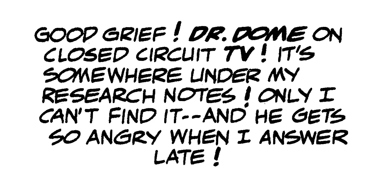
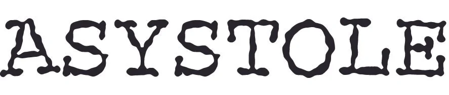
Here is a bitchin' sample of hand-made comic book lettering, from what I consider to be one of the most perfectly lettered comics ever published. It is from Plastic Man #1, cover dated November-December 1966, lettered by the great Gaspar Saladino. It was a very funny story, written by the eternally goofy Arnold Drake and drawn by Eli Katz, whose nom de plume for comics was Gil Kane.

The story's funny, and so's the lettering. Even the balloon shapes were funny, as I'm sure you'd agree if I'd shown them. Gaspar was lettering more than a dozen comics every month at this point in his life, and most of them were quite serious — as were his letterforms. But here he fell into the zany mood of the story, and you can feel it at a glance.

That's charming characteristic #1 of handmade lettering: its letterforms reflect the mood of the story.

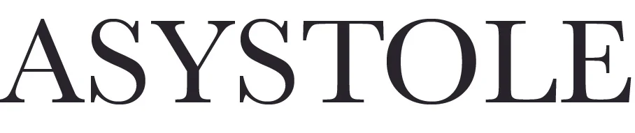
This falling in with the mood is tough in digital work, and I've made little attempt to chase after it in type design. Crafting a usable font family takes months, and it's really not practical, given the other production values I insist on in designing type, to have "funny" families and "serious" families. I've tended to let the story and art provide that sort of atmosphere, and hoped that my letterforms reflected that mood, even though they're precisely the same for funny stories and serious stories. I do have a few goofy type families, and I occasionally use them, but for the most part, one family is used for everything.

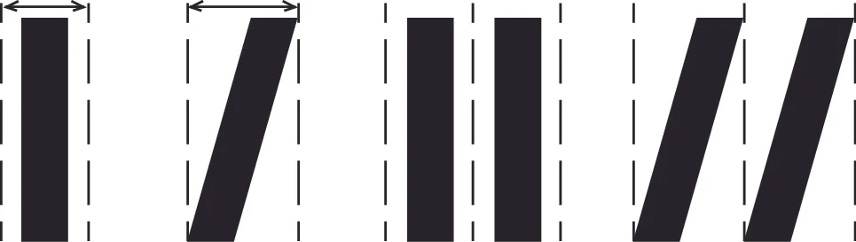
A closeup sample of the most ubitiquous character in the English language, the letter E, will spotlight another characteristic of hand lettering:

E's.jpg

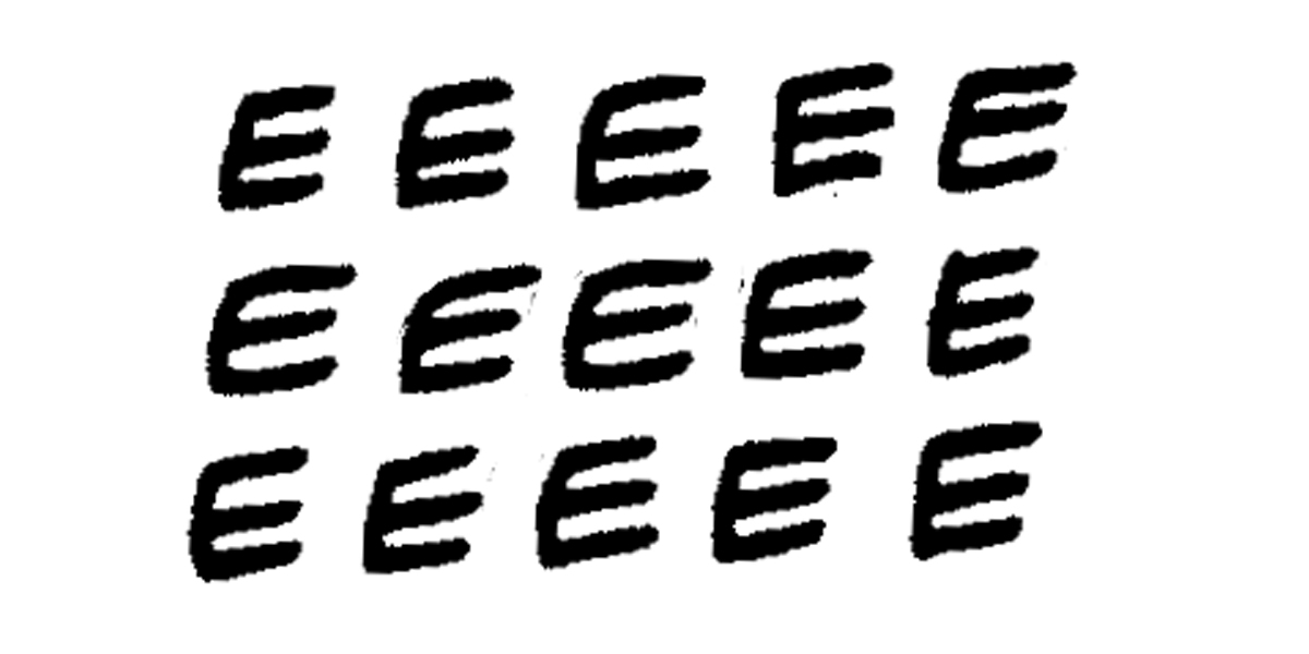
In English, the letter E appears, on average, about every seventh letter. In other words, 14% of all letters in the English language are E. The block of copy shown earlier has 111 characters, of which 15 are the letter E, which more or less conforms to the rule. Other characters appear often, but they run a distant second, third, fourth and fifth to E.

These fifteen Es all carry a familial resemblance, particularly in the line weight of Gaspar's beloved FB6 pen point. But they're all clearly different one from another, and this is charming characteristic #2 of handmade lettering: the 26 letters of the alphabet, no matter how often each appears in a block of copy, never precisely repeat themselves.

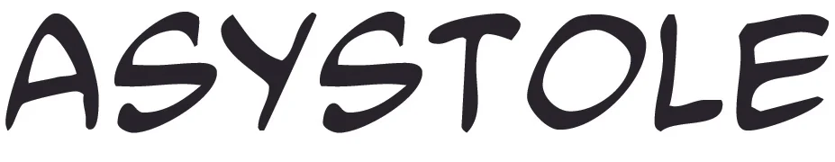
In my quest to replicate the look of hand lettering, one experiment I tried was a body copy type face with dozens of variant versions of each letter of the alphabet, plus a proprietary word processing program which would randomly substitute one sample for another. The program, designed by a friend of mine in return for a steak dinner, was quite something to watch in action. I'd take a comic book script, open it up in the program, and wait ten or fifteen minutes. The program literally chose, at random, one of dozens of versions of each letter of the alphabet and each piece of punctuation, for each appearance of each letter or punctuation mark.

The font family I used was based on a series of thousands of samples of each letter of the alphabet and each piece of punctuation. I lettered Buffy the Vampire Slayer for Darkhorse comics for many years, and one day the company sent back hundreds of pages of overlay lettering I'd done for the strip. I almost threw it all away before realizing that it could help me out in designing type. I went through the vellum lettering, selecting dozens of versions of each letter. These samples were cleaned up and made into a type face which the random-substitution utility could work with. Presto. If a block of copy had 36 E's, 15 R's, 18 S's, and so on, the font and the substitution program ensured that nothing ever repeated.

It all worked visibly, on the screen. The ten or fifteen minutes it took were very entertaining to watch, particularly if you had a drink in your hands. It worked. It looked handmade. My quest was over. My life was complete. Characters never repeated. There was only one problem:

It looked awful.

Before I realized this, I introduced the new technology to my various clients with great fanfare. No one said much about it, until I used it for a wonderful Vertigo miniseries, and afterward heard from the editor, who was perplexed. She wanted to know why my lettering looked so amateurish all of a sudden.

At first I was pissed off. Who was she to complain? For the first time in four years, the company was getting lettering that looked handmade. But then I looked at the books I'd used the technology on, and had to admit that handmade wasn't everything.

I apologized profusely, and relettered the books that'd been published conventionally, in time for the trade paperbacks. The editor is still a friend, although I can't understand why.

But I had learned a painful lesson about charming characteristic #3 of handmade lettering: the 26 letters of the alphabet, even though they never precisely repeat themselves, must always look beautiful next to each other.

But exactly how do they look beautiful, in a way that my random sampled characters never could? The answer to that is going to have to wait a bit. In the meantime, take comfort that the problem got solved, even though it took my hernia surgery to help bring this to pass.
 

ASYSTOLE, or the Art of Designing Type for Comic Books, Part 2

Now that we've hopefully cleared up my misunderstanding of Richard Starkings, John Roshell, and Comicraft regarding their philosophy of type design for comics, I'd like to go into the things which I felt needed to be addressed when I got around to following in their footsteps, turning my own hand lettering style into type which could be used in the all-digital environment in which comics are made these days.

Let's look at the problem using as a case in point a technical term used by doctors and those who examine EKG charts. It's a lovely word for a difficult problem, when there is no detectable heartbeat. As problematic as that situation is, the word itself brings to light some problems for those of us who wish to design type which suggests the way a craftsman with a pen shapes letters. But before we get around to the craftsman with the pen, let's look at the word as seen through the medium of the long-forgotten manual typewriter.

1_mono spacing.jpg

The typewriter, due to the technical limitations of its early design, could not allow the various letters of the alphabet to occupy different amounts of horizontal space. Upper case, lower case, I or W or even a period, all of these were assigned exactly the same amount of horizontal space. This is referred to as Mono Spacing. Mono Spacing is at its least offensive in an all upper-case environment, such as is seen here. There are two S's, both identical.

Both the sameness of spacing and the sameness of identical characters were problems which I, and everyone else who wished to design type for comics, wanted to overcome, as these do not resemble the work of a human being holding a pen. Such a person can never shape the same letter exactly the same way twice, even if he wants to. And he certainly does not assign all glyphs the same amount of horizontal space.

2_unit spacing_baskerville.jpg

This brings us to the next step forward, although it predated the typewriter by 400 years. This is Baskerville, one of the great classic type faces of the Western world. In the era of moveable type, each character of the alphabet was a separate piece of metal, and could occupy as much or as little horizontal space as was needed. There was no situation where every character was the same width.

But because these pieces of type occupied a given width, characters couldn't be brought closer together, even if the eye felt that such a compression was necessary. For example, the pairs AS, TO and LE look fine. But SY, YS, ST and OL all feel, at least at this magnification, like there is an undue amount of white space between characters.

It is a testimony to the brilliance of the early type designers that this problem is almost undetectable in a printed block of text, although italic alphabets can seem wrong to the eye. The reason for this is obvious: slant a character and you're adding white space, if there is no way to subtract from the distance between that character and its neighbor.

The two Roman I's can sit a comfortable distance from each other, but if we slant them, they must be further from each other.

The two Roman I's can sit a comfortable distance from each other, but if we slant them, they must be further from each other.

It is, in fact, a testimony to the genius of the great type designers that italic alphabets were not only made and used, but that the presence of extra white space, rather than looking clunky, actually had a look of great elegance. In the opinion of many, myself included, the single most beautiful font ever designed in our alphabet is Caslon Italic. Even today, with all of our technology, it's never been equalled.

Still, having an inviolable quantity of white space on either side of each character of the alphabet remains a problem to the eye. When the so-called "hot type" machines appeared in the second half of the 19th century, their advent brought no solution to that problem. Each hot type character still had its own width. Nothing could bring two characters closer together except for proofs, a razor blade and rubber cement. I was a teenager before a practical solution to this problem came to be, namely photo lettering. The technology of the late 1960s enabled characters to be optically moved close together or far apart. Page through a magazine or book cover from the 1970s to the mid 1980s and you're bound to run into examples of this technology.

But in the meantime, if you wanted to do a decent looking comic book, you had to hire a human being. Fortunately so, for me and a few others, who were able to make a tidy living with Speedball pen points, rapidographs, and india ink.

3_unit spacing_mongo.jpg

This is the second type face I ever designed, based on my own hand lettering. It has many of the same problems as the Baskerville example above. Each character has its own horizontal quantity of space, but to the eye it looks wrong. Here the culprits are SY, YS, ST, and TO. No human being with a pen would have made these errors, but in the early days of optical type, they posed a formidable problem.

4_kerned_mongo.jpg

Here is a solution, known as "kerning". While "spacing" applies to the amount of horizontal space assigned to each character, "kerning" applies to pairs of characters. Kerning is a series of exceptions. The designer, in effect, says, "The width of the upper case S is so many units except when the next character is a Y" or "The width of the upper case S is so many units except when it follows a Y", and so on. Kerning enables characters to be spaced farther apart or, more often, brought closer together with certain other characters. Above is the same word, typed in the same font, but with kerning enabled. It's not perfect, but it's easier on the eye.

My father came of age in the era of hot type, and never entirely accepted the rather sterile look of photo typesetting. Even into the late 1980s there were hot type machines in operation, and Pop often hired them to obtain effects not possible in the photo lettering of the time. He was certainly aware of kerning, and had done more than his share of such work with a razor blade and rubber cement. But an extended list of kerning pairs added to the computer memory requirements of a type face. When I began designing type, Pop and I discussed the problems inherent in the task of kerning. His advice was to identify maybe 100 pairs, take care of them, and let the others attend to themselves.

By this time, Pop had lost his vision to macular degeneration. I couldn't show him the problems of only 100 kerning pairs. It's like eating one salted peanut. The need just snowballs.

Modern computers can handle a gazillion kerning pairs, assuming the designer has the patience to identify them. But there are also lot of other cool things that modern computers can do, which brings us to the Holy Grail of comic book type design. But I guess that'll have to wait for Part Three.

ASYSTOLE, or the Art of Designing Type for Comic Books

I began lettering comic books professionally in 1977, for Gold Key Comics, then DC, then Marvel, and in the years since pretty much every publisher except Archie. Had I known back then that I'd still be doing this sort of work in my sixties, I wouldn't have been happy to hear it. Whether it was the optimal outlet for my energies, it's helped pay the bills and at its best, it's an awful lot of fun.

Thirty years ago it became clear that eventually computers were going to replace human beings with ink pens. The early digital lettering wasn't much to look at, but its advantages loomed over every letterer's head. It takes ten years to learn to letter well by hand, but anyone with a computer and some decent software can do it at least passably. Marvel was the first major company to really embrace the technology. DC, a company which has always been more finicky about the way stuff looked, held back, As late as 2001, the Vice President at the Vertigo imprint of DC Comics told my wife that there was little danger of my work, and that of my hand lettering colleagues, ever being replaced by digital lettering. Hand lettering just plain looked better, flowed in harmony better with hand-drawn pictures, and had an elegance lacking in even the best computer work. There simply was no comparison.

It was two years later than this same Vice President had to spend the day phoning every freelance letterer in her rolodex with the bad news: In six months, all such work was going to be done digitally, by an in-house staff. I didn't envy her having to make these phone calls, one after another, to a pool of freelancers whom she had treated as friends for years. But that's why she had the corner office, to do the dirty jobs when necessary.

Like most of my colleagues, I'd piddled around with digital lettering, and done a few projects on the computer. I did a graphic novel for Vertigo called Orbiter digitally, and a miniseries for DC called "Death and the Maidens". It was okay. A little sterile, and not a whole lot of fun to do, but workable.

What bothered me about digital was the sameness of the alphabet or, maybe, two alphabets available for lettering. Hand lettering always meant a panoply of different letterforms. If your digital font is all upper case, then you can have two slightly different versions of each letter of the alphabet available, if you care about not repeating characters. If your upper case E is slightly different than your lower case e, and if you have to type the word "glee", then you can type "gleE" or "GLEe" and avoid the obvious repetition.

The two guys who really blazed the trail in making digital lettering viable were Richard Starkings and John Roshell at Comicraft. But part of their business philosophy was that they would make no attempt to make their lettering appear to be handmade. The stuff was digital, and digital was just fine. Comicraft may have put a lot of other guys out of business, but it's hard to fault the quality of its best work. I don't know Richard well, but John Roshell is a friend, and has designed some beautiful type families. After perfecting their process over some years and thousands of pages, Comicraft began selling its type, and the digital lettering market was suddenly open to anyone with some visual savvy, a computer, and a copy of Adobe Illustrator. Nate Piekos, another excellent designer, followed in Comicraft's footsteps, selling comic book type to those who wished to do lettering.

Through some very wise counsel from my wife Lisa, I was able to remain in DC Comics' freelance pool, even after almost every other letterer was let go. How that happened is a story in itself. But once having been accepted as one of the people who would provide DC's books with digital lettering, I had to learn to produce the stuff, and do so in a fashion that would satisfy my own sense of what digital comic book lettering ought to look like.

It took me six years to figure out how to do what I felt must be done; in the years prior to that, I produced a few thousand pages which, to my way of thinking, were rather lifeless. The quest was to find a means of producing lettering with the sense of playfulness which occurs automatically in hand lettering and, for that matter, in any kind of human handwriting.

The essence of the problem which has to be solved can be illustrated by one word: ASYSTOLE. Chew on that for a bit, and stop in for Part Two. I'll explain all.

The Spillway Girl Part Two

July's Spillway Girl opus was a design which underwent very little change once its main lines were transferred to the full sized canvas. Having painted the scene once as a small sketch, and having tried various other compositional schemes, I had settled on what it was I thought the picture wanted to be. Its various stages of completion were just refinements. Maybe there's a lesson in that. Abraham Lincoln said that if he were given six hours to cut down a tree, he'd spend four of them sharpening his axe. My sharpening time, chronicled in previous essays here, enabled me to work efficiently and well. And an added bonus, a model who wanted badly for the picture to succeed, was a benefit that's impossible to overstate. When I wanted to stay home and make comic books, she had a habit of calling and asking when I planned on showing up at the Spillway.

The various stages of the picture need little explanation. Here they are:

7_12_2017_day1.jpg
7_12_2017_day2.jpg
7_12_2017_day5.jpg
Living with the picture day after day, I began to crave certain rhythms absent in the initial pose. The above sketch was an idea which I thought would improve the picture. Having a living model, I had the option of making such changes without sacrif…

Living with the picture day after day, I began to crave certain rhythms absent in the initial pose. The above sketch was an idea which I thought would improve the picture. Having a living model, I had the option of making such changes without sacrificing the verisimilitude which one often loses when working from the imagination. The crook in her wrist, and the action of her sandal which amplified it, appeared to be an improvement.

7_12_2017_day6_adj.jpg
7_12_2017_day7.jpg
7_14_2017_day8.jpg
7_12_2017_day10.jpg

It's not exactly a linear progression, in which nebulous forms come out of a fog into sharp focus. Rather, the sharp focus is a matter of my own realization of what I sought. Hard edges are softened, hardened, softened again. Generalized form and color are made very specific, regeneralized, and respecified. What nudges the picture forward? What can be done without? One can't keep going forever, although Degas' clients were rightfully wary of ever allowing him to borrow back pictures they'd purchased from him: likely they would never satisfy him, and they'd never be returned.

That said, after all of these sessions, I considered the picture a success, and I still do.