Painting for the People

Considering the amount of time required to produce a good picture, it can be tough to convince people to buy them for anything resembling a fair price. One does nobody any favors by working at a loss. Still, pictures are supposed to be seen, not stored away.

One solution to the problem is selling good quality reproductions. By that standard, this is a very good time to be alive. Today's technology makes it possible to sell prints at a reasonable cost, prints which are virtually indistinguishable from the original, unless you are interested in the surface quality of oil paint. Thus far, nobody's managed to reproduce that, although with 3D modeling programs, i wonder if that day is very far away.

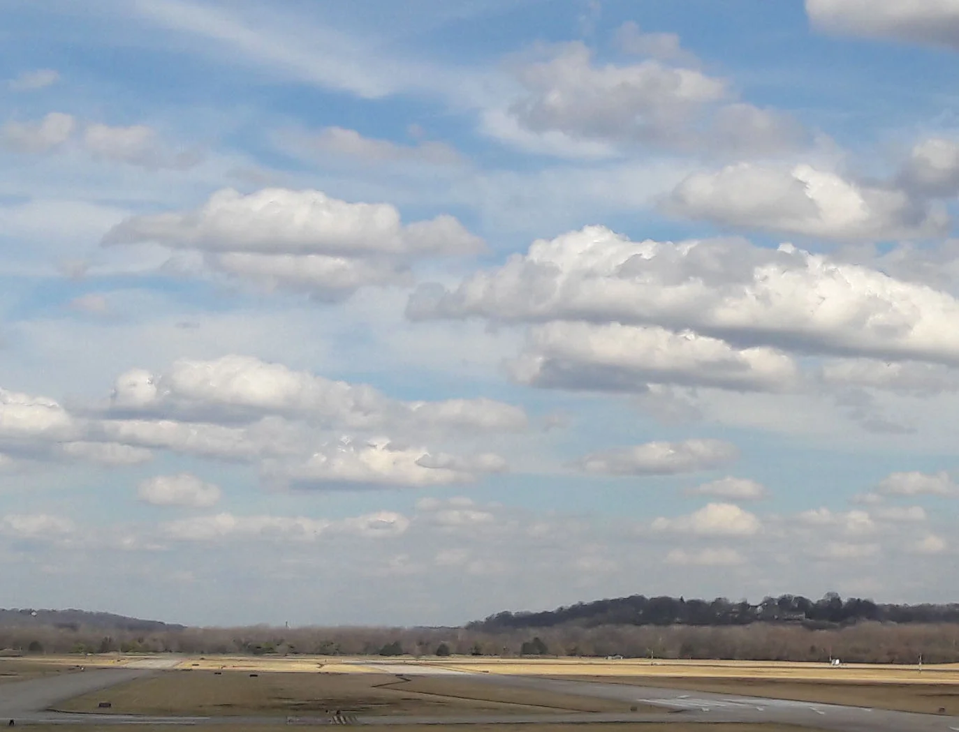
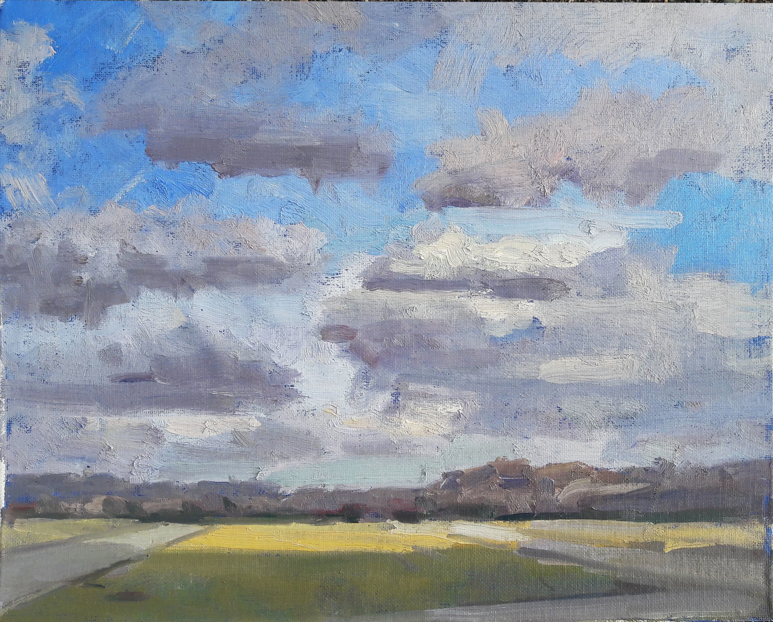
Here is a painting I did last summer, of the Cincinnati Pops performing under a tent at the Green Acres Arts Center:

august concert.jpg

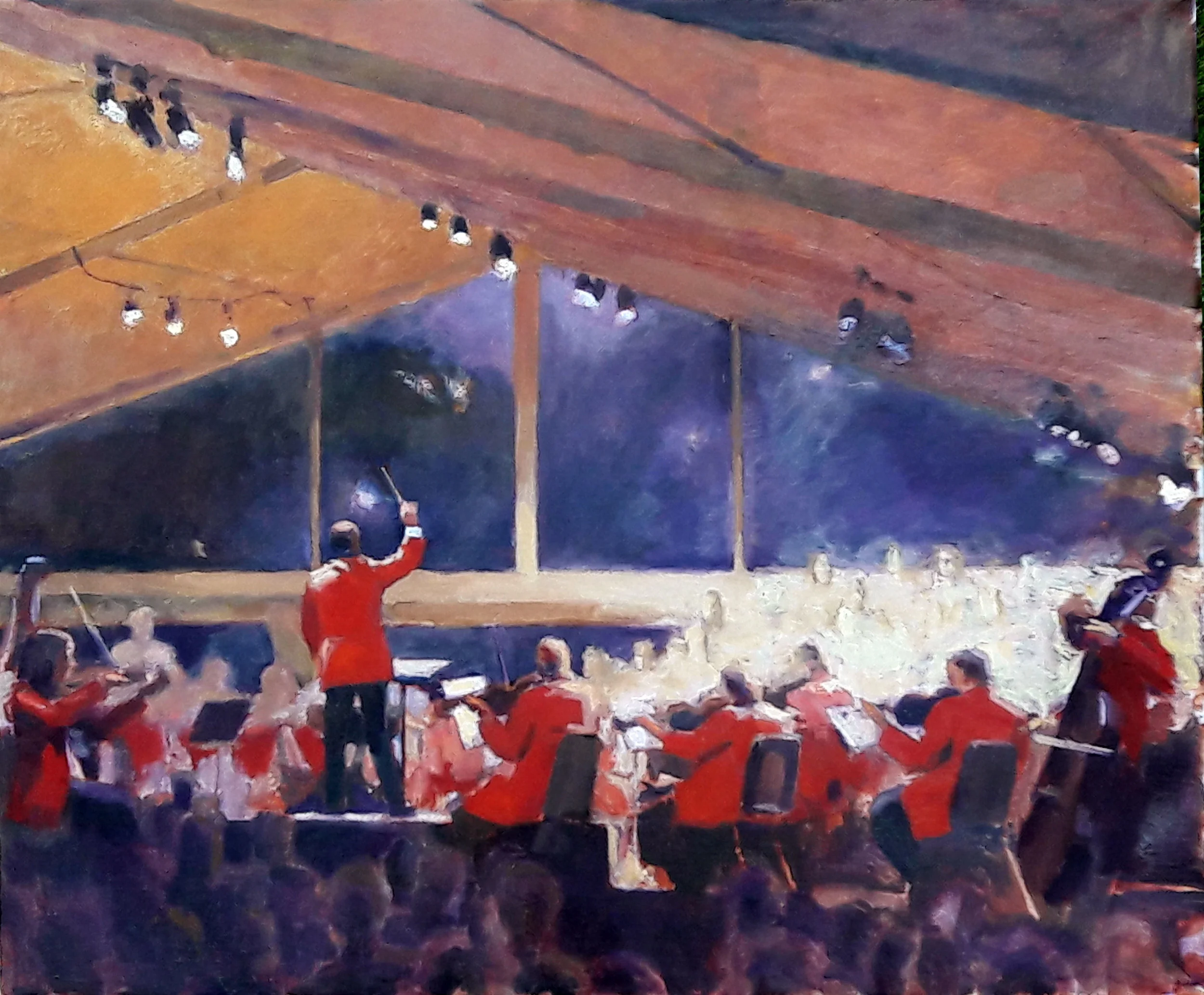
It was a major production, and a large one. I priced it accordingly, but there were no takers, until one viewer inquired about purchasing a print.

Suddenly the stratospheric price tag came within reach. Too much so, in fact; when it's all said and done, the only ones who will make money on the deal are the printmaker and the gallery. But that was a matter of poor judgment on my part. Had I asked enough to ensure a profit for me, the buyer would have given it. The giclee was printed onto canvas, stretched to the exact size of the original. All the buyer needs is a frame.

There are cheaper processes than the giclee shown here, and I wonder if these might hold a better promise. If a picture such as this one were reproduced onto canvas with a little of its contrast muted, perhaps highlights and darks could be directly painted onto the print surface in oil. This would add the desired surface quality to the picture, and make each reproduction an original of sorts.

It's not the same as the real thing, but it's close. Ultimately I'd like it both ways, with originals finding their way into the hands of people who would enjoy them and pay for them, and reproductions for those who can't see fit to plunk down thousands of dollars for a picture. The point isn't money, except for me. The point is adding something to the lives of other human beings. If giclees can make this possible, why not?

Acutance and the Three Zones of the Sky

Acutance is a term generally applied to photography; I've never seen it used in reference to landscape painting. But the word can be pressed into service in describing the characteristics of the daylight sky as one's attention descends from its zenith to its horizon.

2_20_2018_1_motif.jpg

Here is a motif I painted this afternoon. While it doesn't pay to get too formulaic about things, there is one characteristic of a cloudy sky which, in my experience, has never been violated — not by nature, and not by painters seeking to replicate nature. It involves today's magic word. Acutance can be defined as the sharpness of an image, although that doesn't really capture the essence of the word. It's not necessarily sharpness of edge, although that can be involved. Nor is it necessarily a matter of high contrast, although that also can be involved.

Acutance is more a matter of detail in the various values which make up an image. A black and white photograph with high acutance will show a full range of values, rather than generalizing them into one or two values.

Back in the days of silver nitrate emulsions, the film most renowned for its acutance was Eastman Kodak's Panatonic-X. It was terribly slow, with an ASA rating of 40, as opposed to Tri-X Pan's 400. No photojournalist would mess with it. But its acutance was a wonder. You could liken it to what Jimi Hendrix could do with a guitar, hitting twenty notes in between each note on the scale. With Panatonic-X's range of value and crispness, it was the Rolls Royce of black and white film, if you didn't mind having to use very slow shutter speeds or wide apertures to compensate for its slow speed. Not very contrasty, but you could bump up contrast when you printed. Acutance was the stock in trade of the great black and white landscape and portrait photographers: David Vestal, Ansel Adams, and so on. They'd use Panatonic-X, or the midrange Plus-X Pan or, in a pinch, the speedy Tri-X Pan, but holding its 400 ISO rating back a stop to 200 by cutting its developing time to 3/4. Acutance was a commodity weighed against other factors. If you wanted to capture action in a dark-lit situation, the smart move was to open your lens wide, use fast film, and if necessary, give it a few minutes extra in the developer. Whatever acutance strategy you chose, however, it held for the entire image. Having low acutance in one zone and high acutance in another was beyond the range of the material, and its technology. And here lay a key distinction between what can be captured by the photographer, his processor and his printer, and that of which is seen by the human eye, and painted by the human hand. Look at anything with your own two eyes, and particularly any scene which takes in a wide range of vista, and any kind of equality of acutance becomes a pipe dream. In fact, the whole concept of homogenous acutance finds itself at variance to human perception, and to any picture making scheme intended to resemble human perception. Acutance, like seating on buses in the 1950s South, is segregated. Like it or lump it, the rules change the higher in the sky one gazes. You can ignore that reality, on philosophical grounds, and you may be right as a humanitarian, but your pictures will not resemble what we see in the sky. What you choose to observe and record is your own business, but it's hardly a good example of nature depicting homogeneity.

In the sky, acutance is not equally parceled out. The zones of the sky are separate and unequal. The lower middle area of the sky tends to hog the acutance, leaving the rest of the sky a mush. This asymmetry of acutance is one of the salient characteristics of the sky. The painter ignores it at his own peril.

For purposes of discussion, we'll divide the sky into three zones. The upper zone goes from the zenith to maybe 60º above the horizon. Here it is on the photograph:

Upper.jpg

The upper portion has some contrast, but not a whole lot of acutance. As one looks upward to see the clouds of the upper portion, what is visible is their gray undersides. There is not a great range of value in the clouds viewed from below. The blue of the sky tends to be darker, as you are looking through less atmosphere than one sees in the other two views. On the whole, the upper portion has little acutance and a range of values that hugs the darker side of the sky scale. The blue sky and the gray undersides of clouds are often just about the same value, which makes this area even more nondescript in comparison to what one sees looking lower.

lower.jpg

The bottom portion of the sky, from the horizon upward to about twenty degrees, has still less acutance, and much less contrast. Viewing it, one is looking through the maximum quantity of atmosphere; you're seeing clouds, even if they're so distant that you can't make out their shape. The color of clouds and of sky are very close to each other. It's a mush, although some very subtle and beautiful rosy hues can often be found just above the horizon.

But it's in between these two zones, somewhere in between twenty and sixty degrees above the horizon, where the real excitement is.

middle.jpg

This middle portion gets the acutance, all of it, which translates into clearly visible cloud shapes and the highest contrast. At these middle levels, you're likely to see one or two clouds catching the full blast of the sun, producing a stark contrast with the cloud's undersides. It is best to remember that even within this middle area, acutance is not equally rationed. One cloud is likely to be the most prominent. Like the queen bee rules the hive, that one cloud rules the sky. Identify it, get its shape and edge right, and let everything else go.

2_20_2018_1_setup.jpg

Another view of the same sky, with my easel perched on the hill. That hill covers the lower portion, but you can see the unevenly rationed out acutance. If there are just a couple of clearly defined clouds, lying perhaps 30º above the horizon, this is the characteristic display of acutance in the sky.

2_20_2018_1_day1.jpg

Here's a sketch I attempted of the scene and its sky. I should paint a few hundred of these this year, just to get chummier with the sky and its proclivities. But what acutance the painted sky offers is all concentrated in its middle levels. As I said, formulas aren't how pictures are made, but some things just happen all the time, and one ought to take note of them.

ASYSTOLE, or the Art of Designing Type for Comic Books, Part 4

To understand how a myriad of alternate versions of each letter of the alphabet can look beautiful next to each other, we must consider how a human being might choose to alter the shape of letters as he draws them. This is mostly done to eliminate a lot of excess white space. Here's an example. our test word ASYSTOLE, typeset using the multi-character type family which I eventually developed:

asystole.jpg

This is not the same as type simply kerned, i.e. with characters brought closer to each other or farther apart, based on the amount of excess white space of its neighboring character. Here, the letter S is actually reshaped so as to absorb some of the white space on both sides of the letter Y.

This mimics the work of a human being. Look back at our Gaspar Saladino sample once more:

Gaspar1.jpg

A lot of the paired characters here have no particular rhyme or reason for their altered shapes; Gaspar was clearly enjoying himself, and not thinking too much. however, a few pairs seem here involve the reshaping of characters to fit the proclivities of their neighbor. Here are a few:

gaspar pairs.jpg

In each of the five pairs seen here, one of the characters alters its shape to accommodate the shape of its neighbor. The diagonal bar of the R plunges forward, to fill some of the space below the curve of the C. The S's forward curve is extended to fill some of the W's white space. The R's diagonal bar again is extended into the white space of the Y. The lower curve of the C is held back, allowing the A to fill the space. And the center slat of the E is trimmed a bit, to make room for the backward curve of the S.

In the all-upper case environment used for comic books, we can divide every letter of the alphabet into one or more of three categories: inert, catalytic and passive. And in these three categories lies the means by which digital type can be made to appear handmade.

An inert character is one which is not affected by the shape of its neighbors, and which exerts no influence upon its neighbors. Like the inert gases on the periodic chart, these simply do not react with others. The inert characters are H, I, N and U. What all of them have in common is a simple vertical border on each side. There is nothing to cause a neighboring character to alter its shape, not does such a character have any reason to alter its own shape.

The catalytic letters are those which exert an influence on the characters next to them. Such characters are A, D, F, J, L, M, P, T, V, W and Y.

And the passive characters are those most prone to being affected by their neighbors. These are B, C, E, G, K, O, Q, R, S, and Z.

The reason our sample word ASYSTOLE illustrates this point so well is the presence of the strongly catalytic Y surrounded on both sides by the  extremely passive S. Like a sycophant, the S changes its behavior under the influence of the domineering Y.

Other words which illustrate this are EVERY, REMEMBER, and ACT. In these, a passive letter is bullied by its catalytic neighbor:

13_every.jpg

Note particularly how the first E in EVERY takes on some of the shape of the V which follows it. The two EMs in REMEMBER are affected in the opposite fashion by their neighboring Ms. Similarly, the bottom curve of the C tucks under the white space of the T. C is far and away the most passive character in the alphabet. Any other letter can push it around. A C can even be reshaped by a neighboring apostrophe or comma.

Here lay the answer to my dilemma of the thousands of variant characters not looking right next to each other: develop character pairs (or triplets, quintuplets, or whatever), taking care to have the letters involved behave in the above fashion.

Variety could also be introduced, by providing multiple versions not only of the letters of the alphabet, but of some of their more common groupings. For example, the triplet THE is very common in English, so why limit oneself to just one THE when you can have nine of 'em?:

14_the.jpg

And if you're lettering the same character every month, why not see to it that his name will never appear the same way twice?

batman.jpg

Around the time our previous President was inaugurated, I was laid up for a week after hernia surgery. It was a pretty serendipitous time: I used it to concoct every character pair I could think of. In the years following, the font was constantly under revision: whenever i ran across a situation which seemed to call for a new ligature, I'd stop and design one.

Nine years and more than 3,000 ligatures later, the font family is still under construction, and still getting very heavy use.

Probably not smart to spill my secrets like this, but I'm hoping nobody reading this is dumb enough to follow in my footsteps. It's a pretty heavy price to pay, just for the privilege of faking out people into thinking it's all still handmade.

I also managed to cook up a means of making balloons and sound effects look handmade. Maybe we can talk about it sometime.