When You Can't Believe Your Eyes

Sixteen years ago, I asked a painter friend why his work was so much better than mine, when I was a very accomplished draughtsman. It was a reasonable question. My book The Art of Figure Drawing had been in print for a year, and was about to be translated into four languages. I was teaching figure drawing and human anatomy at the Art Academy of Cincinnati. I drew pretty well. Why couldn't I paint?

I wasn’t just asking about myself but about nearly every other painter in Cincinnati, and there are quite a few of them. I threw out some names, many of whom were people I admired and respected, but there were clearly two groups of painters in Cincinnati: my friend, and everybody else. The difference wasn’t subtle. What was it about my friend that set his work so far apart from that of the rest of us?

My friend, a genuinely humble guy, did not relish answering the question. When I’d asked him out for coffee, he knew and dreaded what I was going to ask, and now I’d asked. He went silent for a while, and then said…

“You don’t perceive shape accurately.”

A long pause, and he let me drink it in.

For those of you who don’t see the hugeness of his statement, let me translate it into simple English:

“You can’t draw.”

I was 48 years old at the time. I’d studied with some of the best painters in the country. I’d studied drawing and human anatomy with the most revered drawing teacher in America. This was a rather bitter pill to swallow.

Another classically trained friend once told me something similar: “Whenever I hear someone say that he can draw well, but he can’t paint, I know that the person can’t draw.”

There is no fundamental difference between painting and drawing; the rules which apply to one apply to the other. The only difference is that whereas slipshod drawing may not be noticed in a pen-and-ink or charcoal sketch, it absolutely screams at you in a painting.

At the coffee shop, my friend offered three suggestions to acquire the drawing skills I lacked: do charcoal drawings of plaster casts; do memory drawing exercises; and paint outdoors a lot. I’m embarrassed to tell you of these three, because although I’ve spent thousands of hours painting outdoors, and have taken two classes in cast drawing, I’ve never consistently followed through on memory drawing. Maybe I will do it now. But if I haven’t done everything that my friend suggested to me, I’ve done a lot of it, and I’ve no longer counted myself a trained draughtsman. I measure everything. I question everything. I rub everything out until I know it’s right. I seek to record the shapes nature presents me with. They can’t be improved upon. I assume nothing.

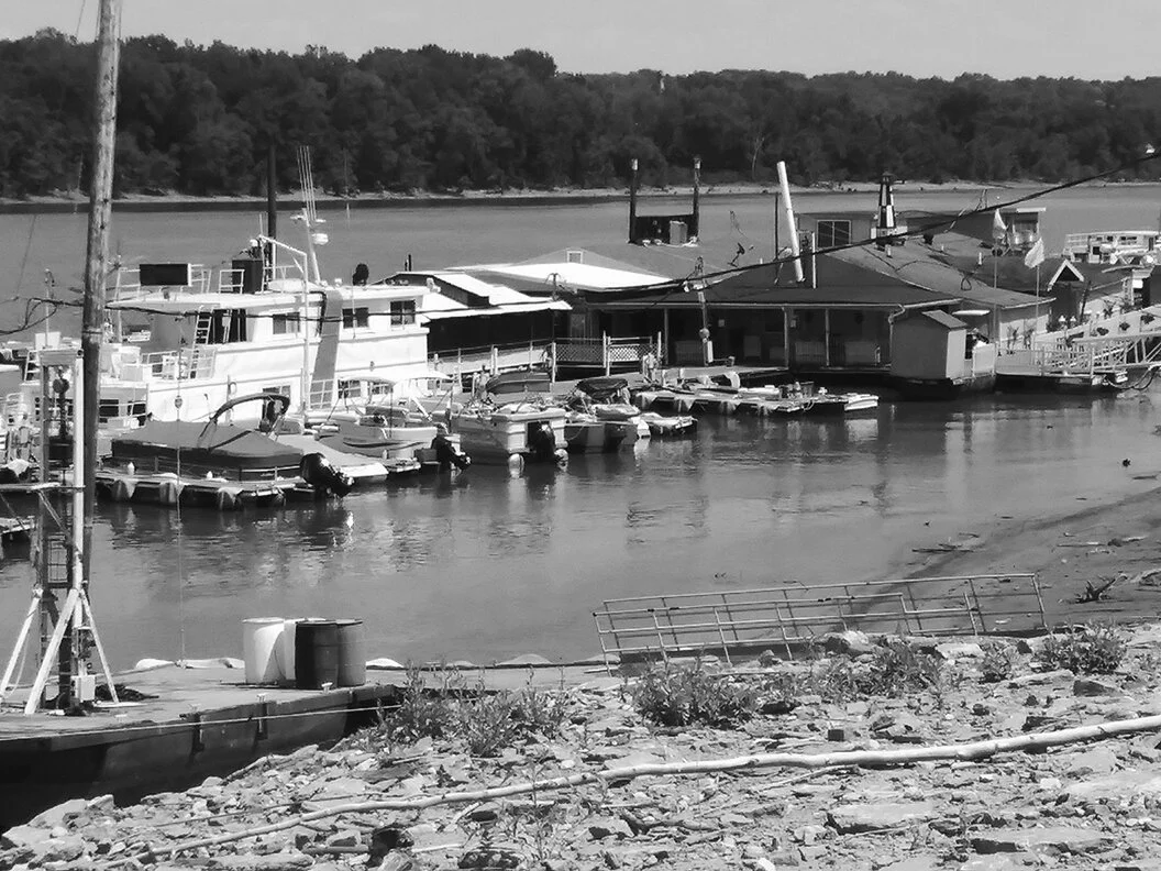
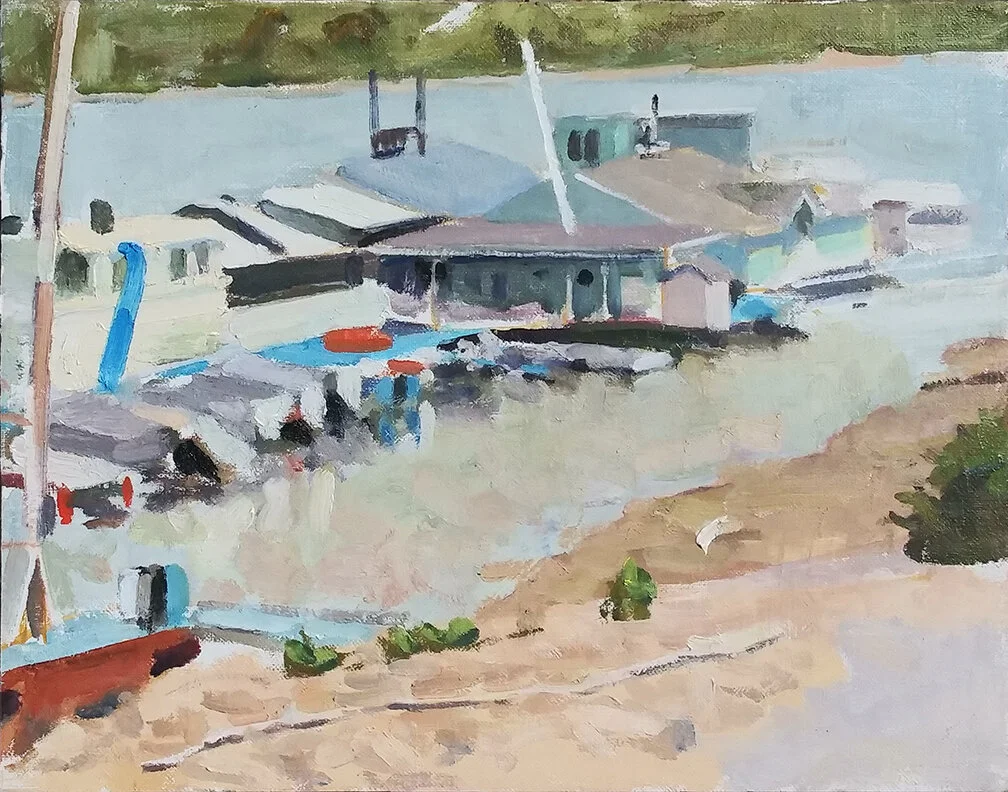
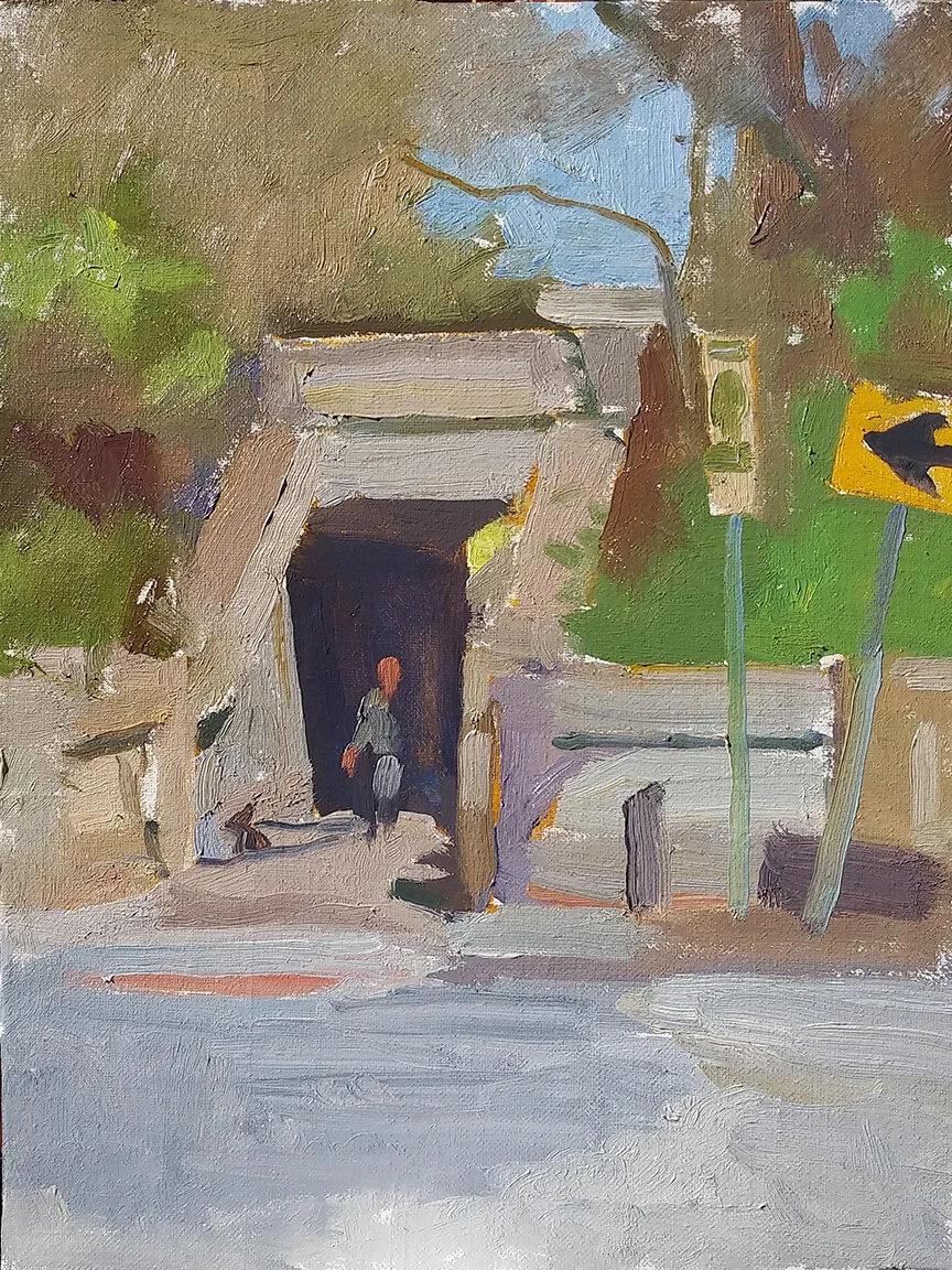
Which brings me to a marina picture I began a week ago:

7_27_2020_day2.jpg

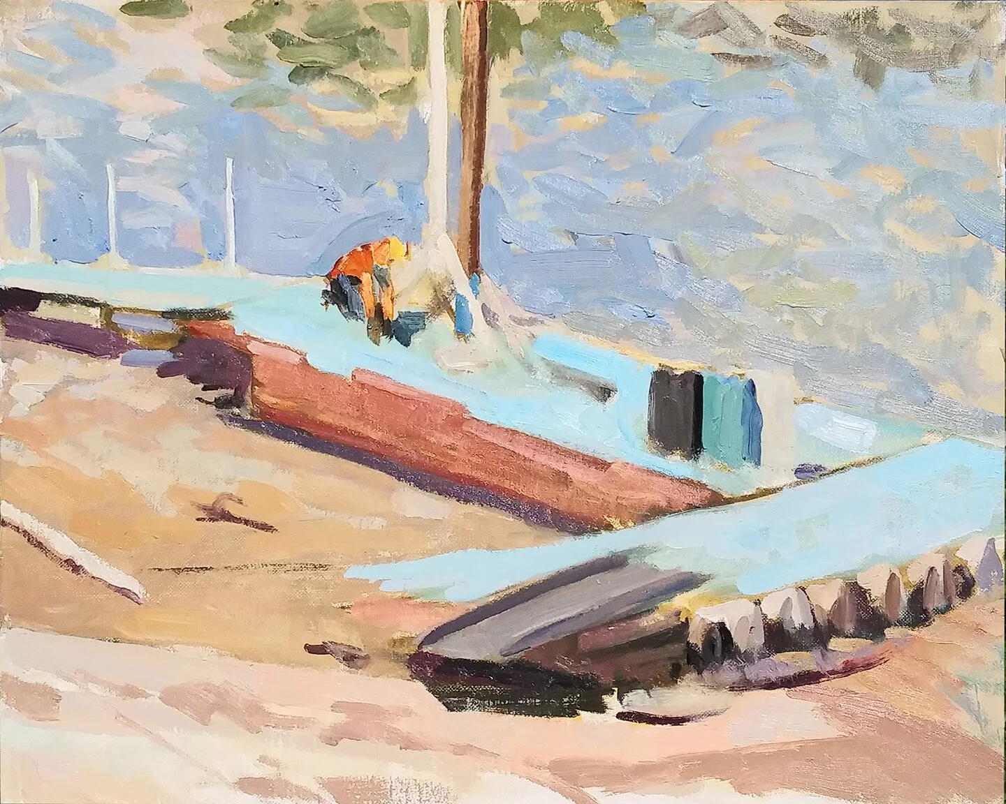
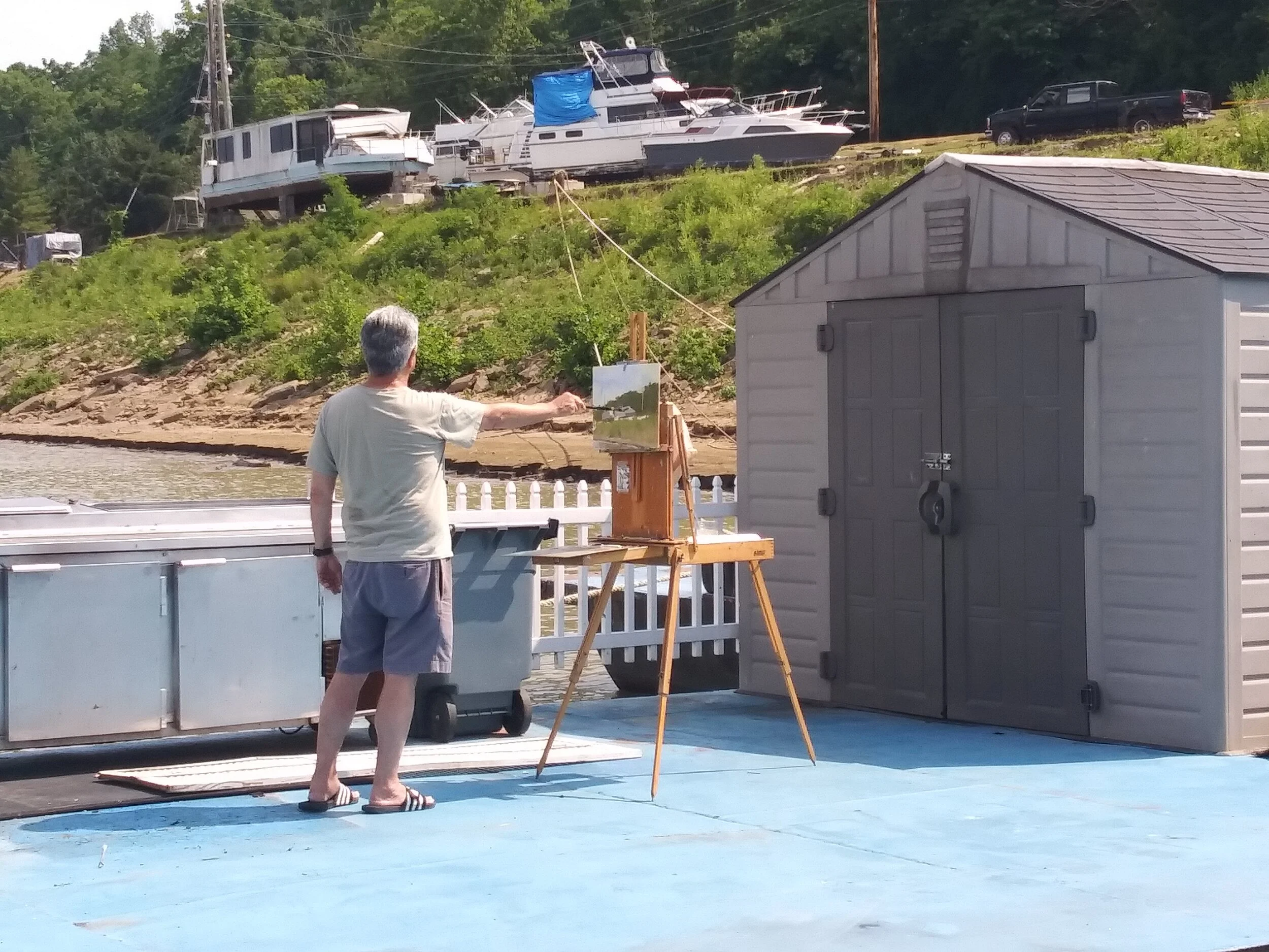
Not the most beautiful motif, but sometimes you have to kick yourself into motion and use the best thing you can find. I stood above an embankment leading to the shore of the Ohio river, looking down at the road a truck with a front-mounted trailer uses to drop boats in the water, and retrieve them.

Those two poles are placed too close to the center of the canvas. The figure crouching next to them needed serious help. But there was a far more obvious error here, one which I didn’t notice until I snapped a photo of the motif.

7_27_2020_motif.jpg

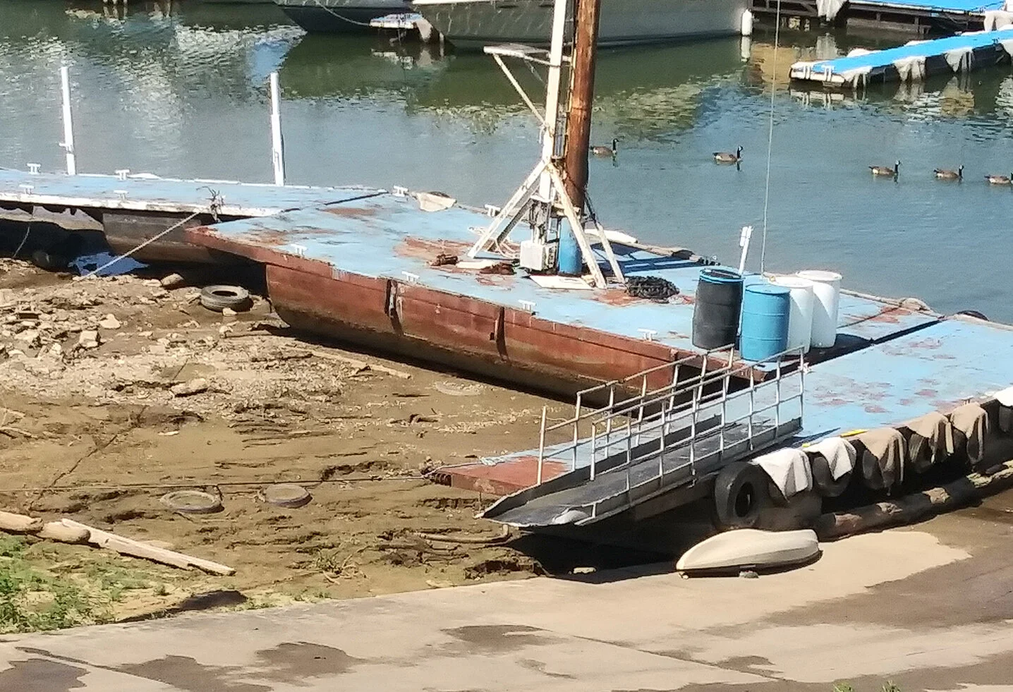
Anybody see a problem here? Not a lofty compositional problem. Not the lack of the guard rails along the gangplank. Not even a value problem, although there certainly were many of these at this early stage. No, this is a plain old drawing problem, and an obvious one.

Any of you see it? Don’t be shy. Send me a note before reading further.

* * * *

Drawing problems tend to be obvious. What’s the biggest mass in the picture? What’s the smallest? What lies above what? What is on the same level as what? It may seem picayune, but it’s in forcing oneself to reckon with such questions that one begins to trudge the path toward competent painting.

C’mon, any takers? Okay…

7_27_2020_diagram.jpg

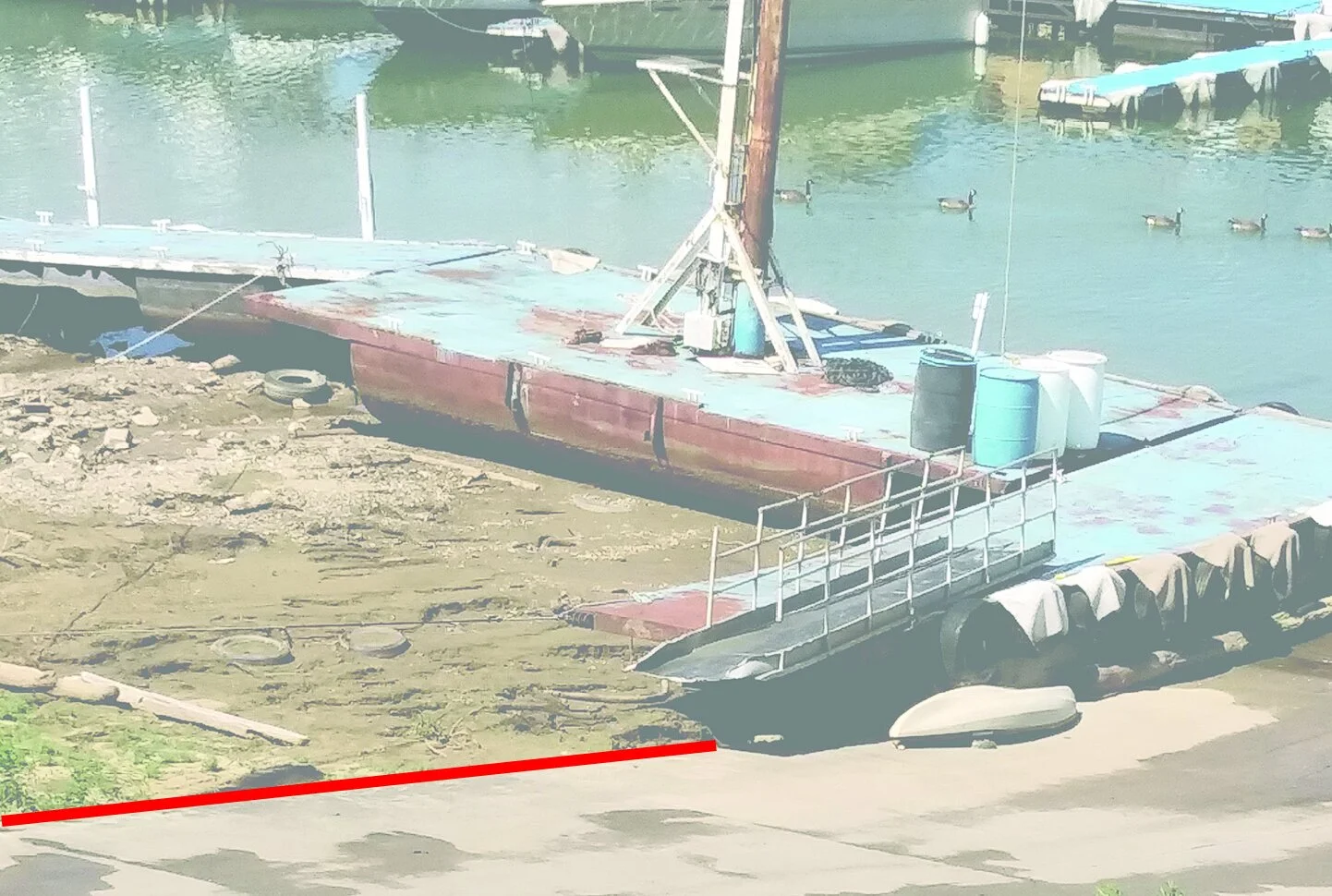
See the outline of the road leading to the river’s edge? It slants slightly downward, not upward.

7_27_2020_day2_diagram.jpg

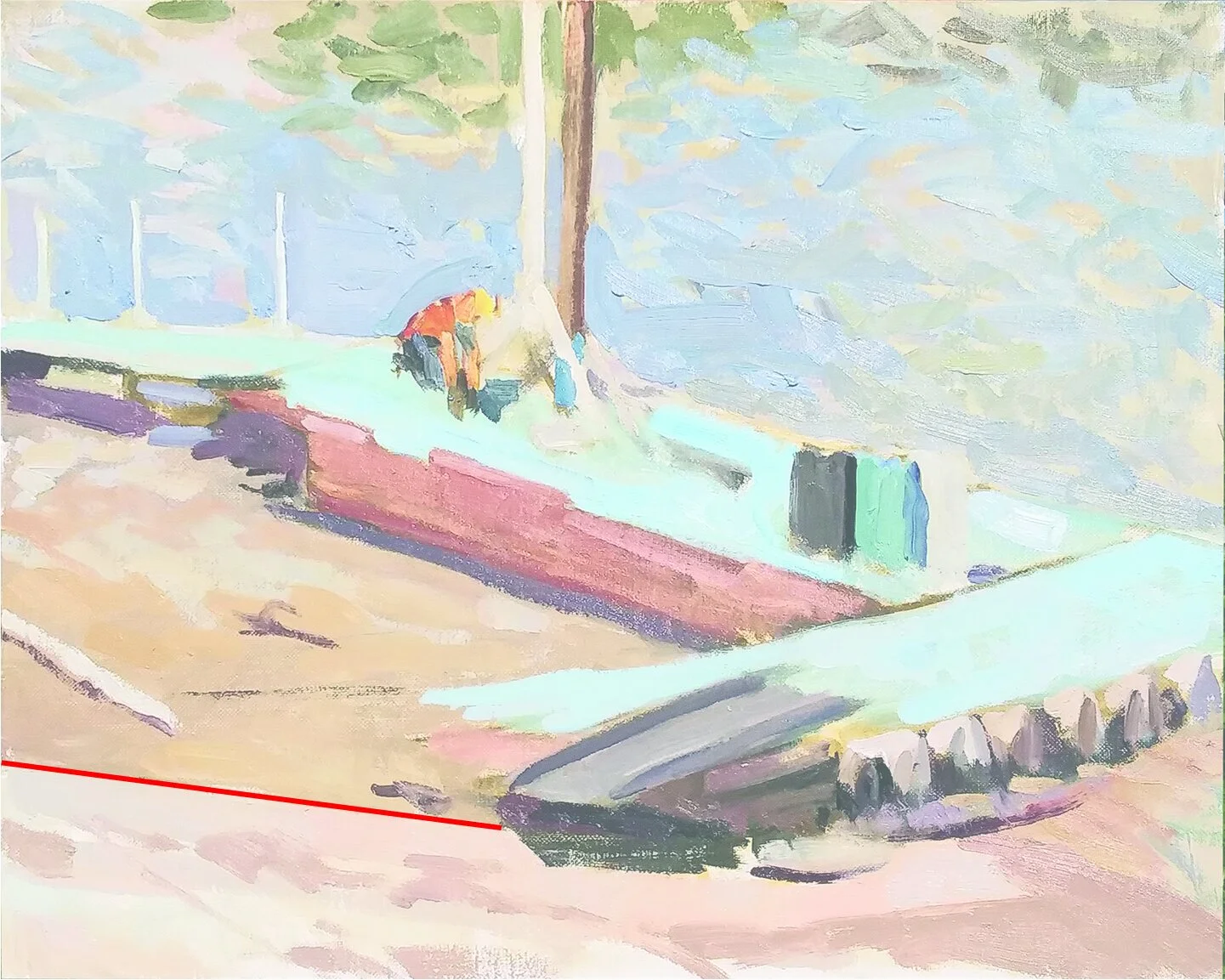
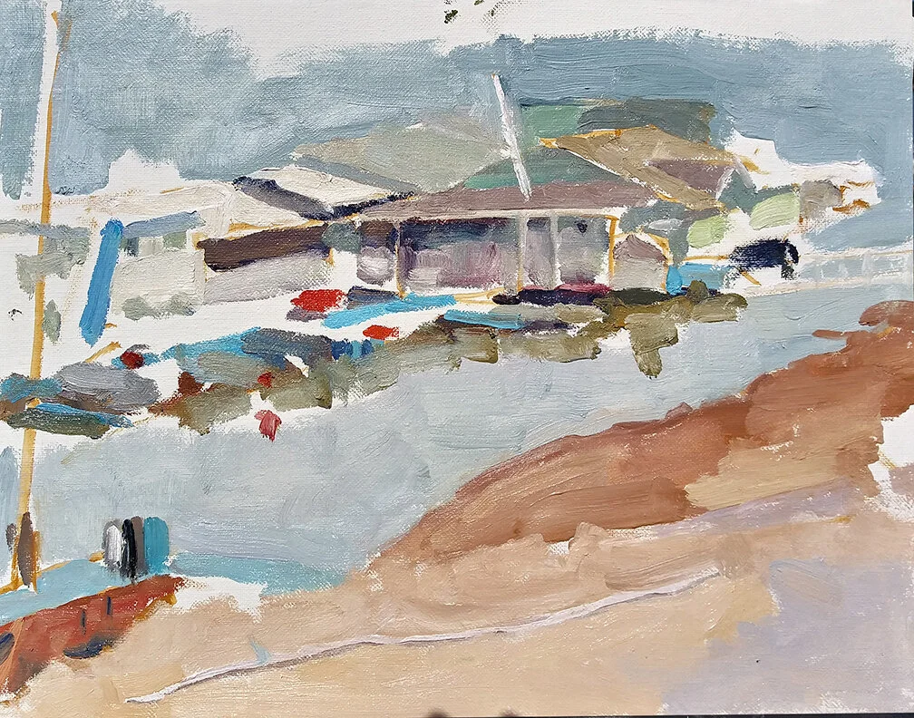
And here’s my Day One, with that same line slanting upward, not downward. Please note that although I check stuff like this over and over again before applying color, I completely missed this one until I looked at the photo I’d taken of the scene.

Genius, it’s been said, is the capacity to take infinite pains. What the hell difference does it make anyway, which direction a line points? The lay-in looked just fine. Or anyway, its problems were a matter of a composiion which wasn’t terribly pleasing to the eye. Who cares about the direction of a roadway?

7_27_2020_day3.jpg

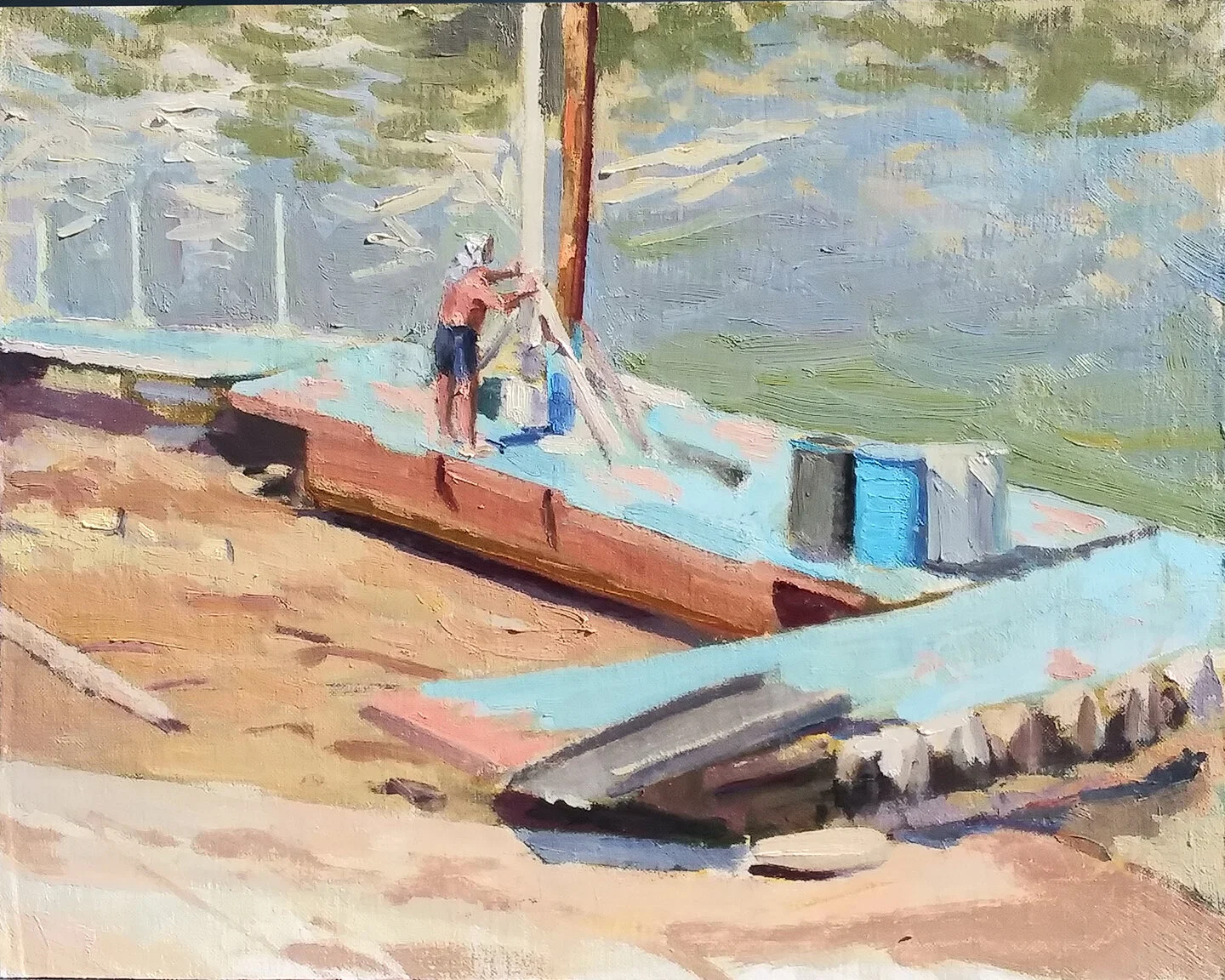
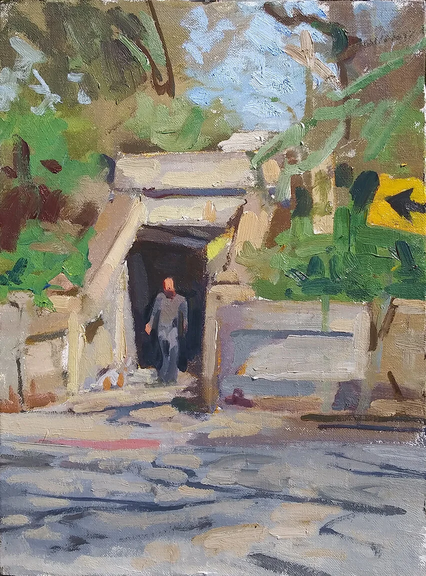
So I gave the picture another day, ignoring the wrongly aimed line. I substituted a better figure. I began to give the dappled water a better treatment. But I didn’t fix the roadway, although four times, I held a brush at arm’s length and aligned it with the outline of the road. Four times I did it, and four times that road sloped downward, not upward. I saw the roadway’s direction, but I simply couldn’t believe my eyes.

One might ask why not, and to me the answer is obvious. In my search for a paintable scene, I’d walked down that roadway several times, and had to trudge back up again each time. It isn’t easy. That road’s downward slope may have been what I saw, but it wasn’t what my tired legs felt, or what I remembered. The roadway slopes upward, and severely so. The effort it took to walk up the roadway blinded me to its actual thrust.

7_27_2020_day4.jpg

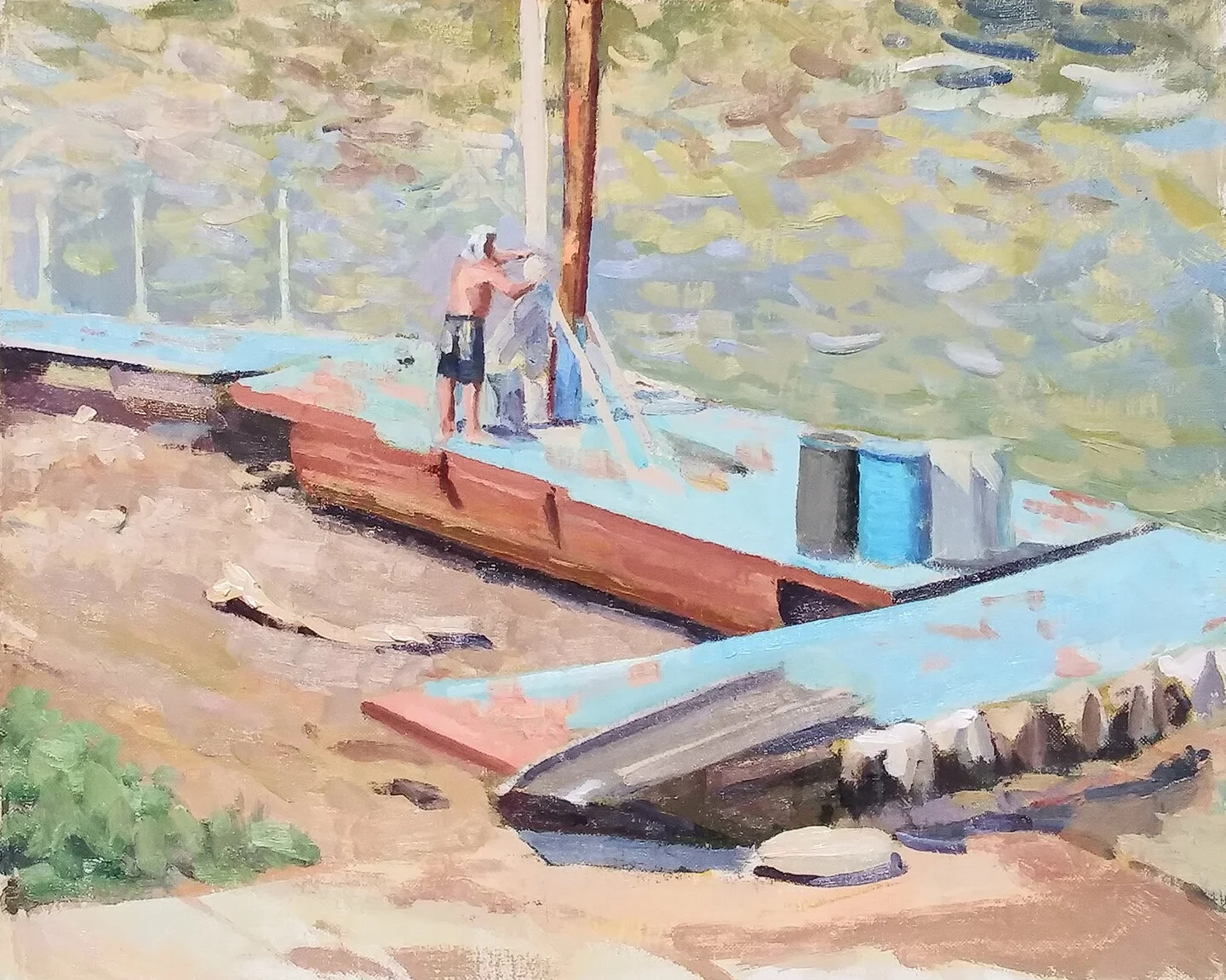
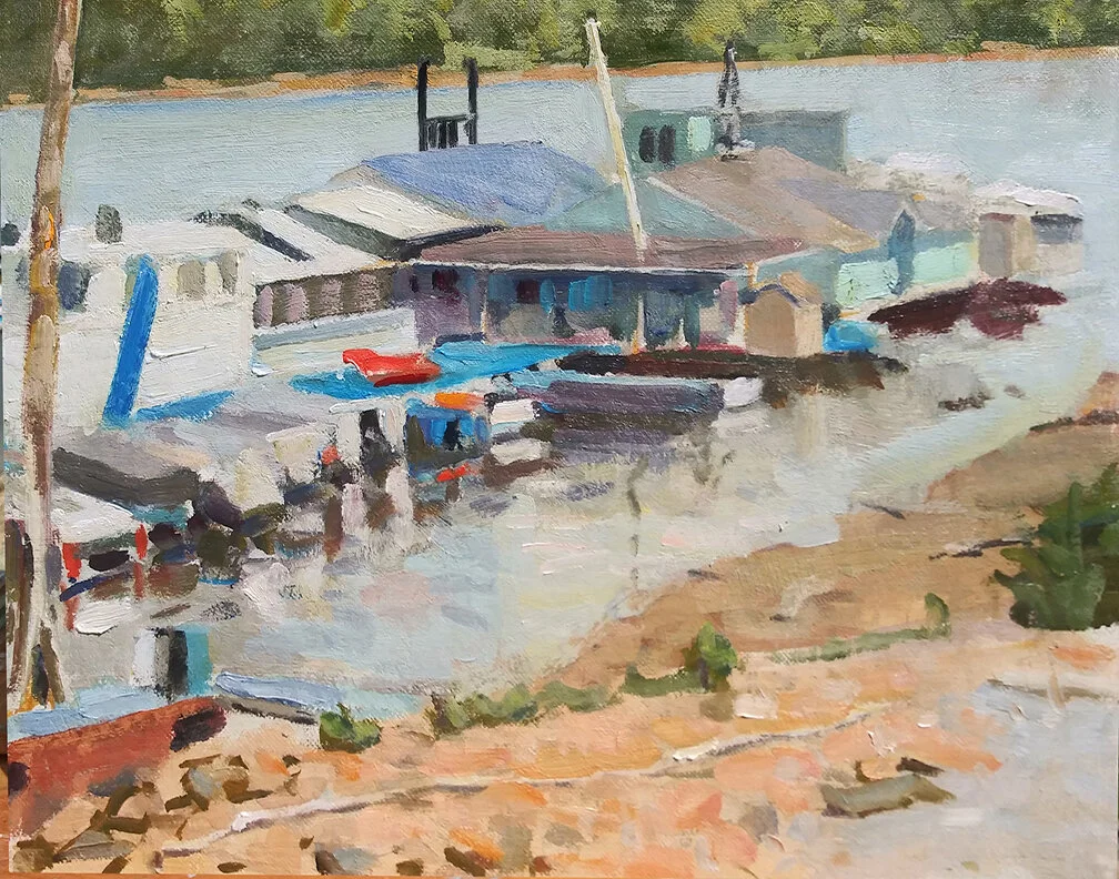
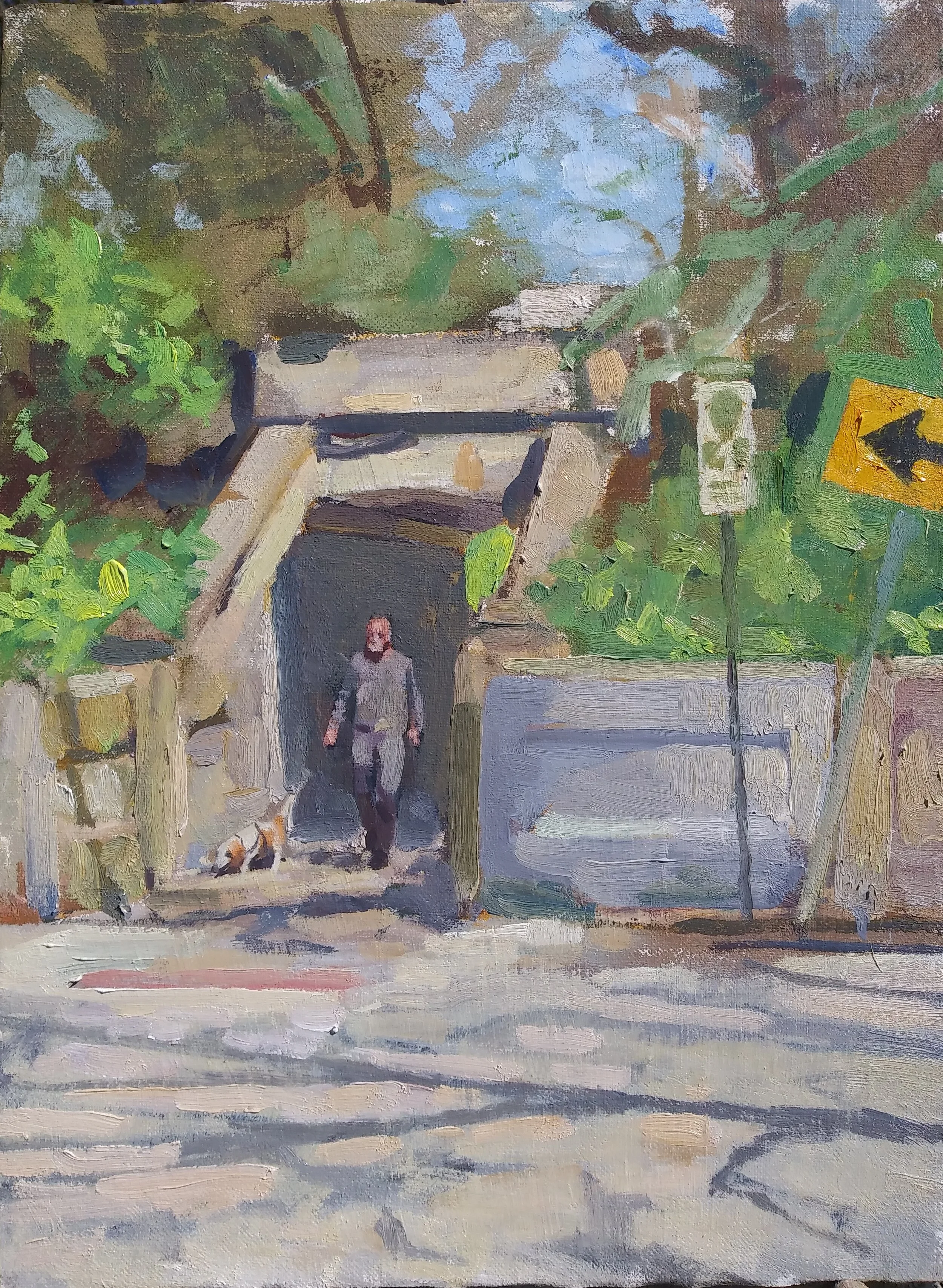
Yesterday I went back, and fixed the offending line. I may give the picture another day. The light’s right. I’m not sure if I want to invest more time in it; the composition doesn’t thrill me. I did make a couple of changes to try and rescue it. One was to change the placement and shape of the tree limb on the river bank. Originally it lay in such a way as to parallel the direction of the dock. I moved it and gave it a comma shape, in an attempt to avoid an ugly repetition. The figure of the man was edited a bit, but it needs more adjustment. If there’s any potential at all for this to become a good picture, stuff like that must be reckoned with.

But getting back to our discussion, one might well ask why it is so important to take the shapes nature doles out. There are several reasons.

One is that nature’s shapes are invariably more beautiful than anything you or I could cook up out of our imaginations. A few years back I was looking at a large canvas in Charleston, SC by a long-dead painter who is hugely venerated by the city’s art lovers. A mediocre draughtsman at best, the painter showed his essential laziness in the way he painted a figure’s shadow. You can almost read the guy’s mind. “It’s only a shadow, I’ll just scribble something and no one will know the difference.” But his refusing to take the time to study out and record what nature offered him doomed the picture from any serious consideration. You can move stuff around if you need to, but nature’s shapes don’t need our editing. That would be like, to paraphrase the playwright and critic Sean O’Casey in his annihilation of Noel Coward’s Design For Living, shining a feeble little light to help us see the sun.

But another reason is that each shape in a scene functions as a checkpoint for every other shape. If you ignore one shape, it will that much harder to correctly perceive the others. If you habitually ignore shapes, good drawing becomes impossible.

Such considerations are the part and parcel of classical training, something of which I only began to avail myself rather late in life, and after having presented myself as an authority on drawing. They are the sine qua non of naturalistic painting. These are the considerations which compel a student to spend months in front of plaster casts before ever attempting the figure, or oil painting.

Do such considerations guarantee that the classically trained painter is going to produce significant work? Not by a long shot. Looking at the work of graduates of the ateliers, one finds a great deal of mediocrity, broken up occasionally by bright stars, people who’ve taken hold of the tools which such training offers, and used them to make serious pictures. No, four years spent in an atelier does not guarantee good painting. But ignoring the sort of training which these ateliers provide absolutely does guarantee that you’ll end up like I ended up sixteen years ago, bewailing my ill-fortune into the ears of someone who, many years earlier, had chosen not to ignore it.

The Complicated Road to Simplicity

One learns sooner or later that the panoply of nature is too large a smorgasbord for one canvas, or even one career. There’s just too much there. And no one particularly needs your complete description of everything you see, or even anything you see. What they want is your elevator pitch. Strip everything down to its barest essentials, and then simplify these as much as you possibly can.

Here’s the evolution of an 11x14” canvas of a complicated scene. It was painted over the course of four afternoons, from life. But just for fun, take a look at a snapshot of the scene:

7_15_2020_motif.jpg

This reminds me of a book cover my father did for the Army Air Force during World War II. It was an airbrush painting of a rack of clouds, the sort of scene that can only be seen through the cockpit of an airplane. On the periphery were the insignias of the various branches of the Army Air Corps, rendered in micro-detail. If you’ve ever attempted airbrush painting, you’ll have some idea of what this entails. Before his death, my father gave the original painting to my son Dylan, who is a Lt. Colonel in the Air Force. I looked it over and couldn’t help but notice that Pop had painted the damn thing at reproduction size.

I blurted out, “Why didn’t you paint it twice up?!”

”Because I’m an idiot,” my father replied.

pop's illustration.jpg

I wish the quality of this image was better; you could see how intricate those eleven insignias are, each one perhaps a third of an inch in diameter. To paint them, my father had to cut tiny masks for each component of the design.

And now it’s July of 2020, and here comes the idiot’s son, with an 11x14” canvas, a lot of ambition, and one thing going for him which his father did not. Oil does not demand precisely drawn detail. In fact, it resists one’s attempts at that. What oil is most sympathetic to are color notes, accurately giving the hue, value and chroma of a little piece of the motif, but not necessarily following its exact shape.

If you’re a fan of high-end computer software, my father with his masks and his airbrush could be compared to a vector drawing program, such as Adobe Illustrator. The painter, on the other hand, uses tools which could better be compared to Photoshop.

So there I was with my tools. “Simplify! Simplify!” goes the adage. Okay, but how?

7_15_2020_motif_BW.jpg

Well, one way is to eliminate color. The French academicians, arguably the most slandered and underrated painters who’ve ever been slandered and underrated, swore by this method. Paint it completely in monochrome, solving every drawing problem before even thinking about color. A full-blown underpainting in black and white is called a grisaille. The procedure makes a lot of sense.

It fell out of favor eventually because Monet and Bazille and especially Sisley, proved that the full blast of nature’s color carried a far greater impact than micro-detailed rendering. But the method still has its adherents, particularly among the students of Jacob Constantine.

But while we’re living in a black-and-white world for the moment, let’s look at an even more extreme sort of simplification:

7_15_2020_motif_BW_graphic.jpg

This is just the above photo, run through Photoshop so as to eliminate all halftones. In this world of pure black and pure white, we can see how convincing an image can be presented with such minimal cues. When I was a teenager, one of the painters I emulated could execute a nude study in oil in two hours using a similar method. He would smear his canvas with a solid body of dark paint, an umber or a heavy green or whatever he wished. I mean solid. This was no earth tone cut with turpentine and smeared thinly with a rag. This was solid wet paint. Next he would paint directly onto this imprimatura with Underpainting White, a fairly quick-drying white lead. The lights of the model were white. The middle tones and darks were the color of the imprimatura. Within the first half hour, he’d simplified the nude into just the sort of binary code we see above. During the remaining time, he adjusted the transitions between the pure dark and pure white. He got what he wanted, every time.

Whether this is your idea of simplification or not, it’s certainly one way of getting the job done.

7_15_2020_motif_mosaic1.jpg

Or, going back into the world of color, we could simplify by viewing the scene as a mosaic. Each piece of the motif gets its own hue, value and chroma. Read color correctly and aim your brush at the right place, over and over again, and a readable image will eventually result. This is essentially the procedure I favor, and did my best to adopt in handling the scene.

7_15_2020_1_day1.jpg

So here I was, on Day One.

7_15_2020_1_day3.jpg

Did Hemingway really say, “I’m not a good writer, I’m a good rewriter”? Beats me. But unless you’re Marc D’Alessio, you may have trouble hitting the note on the first try. You can’t even competently judge how close you are to the mark until the canvas is covered. I’m not a good painter, but I’m learning to become a good repainter.

7_15_2020_day4.jpg

And here it is, simplified about as much as I know how to do. Maybe next week I can see, and paint, more simply. But it ain’t easy.

It's All Downhill From Here

I love summer, which started officially 17 minutes ago, when the sun reached directly overhead of a point along the 23.5-degree latitude. That’s as far north as it gets. It’s all downhill from here. Since the winter solstice, the overhead sun has crept ever northward. Starting a few minutes ago, it proceeds southward. As a Bokononist might put it, so it goes.

This is not directly correlated to the length of the day or the temperature. For some reasons which I have never understood, the longest and shortest days do not occur on the solstices. It’s easier to understand why temperature doesn’t hit a high in late June, and a low in late December. The earth itself heats up and cools down, along with its atmosphere. It takes a bit for the temperatures to hit their highest and lowest points.

But the cause of the seasons is a matter of very simple solid geometry. A given quantity of sunlight falls on a small area of the earth today. Come wintertime, that same quantity will be spread out over an area more than twice the size. The same amount of heat, spread out over a larger area, equals cold. We in the northern hemisphere, in fact, are fortunate that the Earth is farthest from the sun during the summer solstice, and closest during the winter solstice. Consequently, both our winters and summers are milder.

I try to paint outdoors during the solstices and equinoxes, although I don’t always make it. I did today, wandered to a marina along the Ohio River in Kentucky. An arrangement of beached boats looked appealing to me.

6_20_2020_1_motif.jpg

It was 3:00p, almost three hours before the solstice. It was also quite hot, although heat seldom bothers me. My intention was to describe the scene in just one sitting. Sometimes I’m able to do that. Sometimes not.

6_20_2020_setup.jpg

My favorite thing about summer is attempting to describe blindingly hot sunshine on canvas. Again, sometimes I’m able to do that, and sometimes not.

6_20_2020_1_day1.jpg

I guess we’ll know tomorrow whether I will have been able to describe blinding sunshine. But we know already that I was unable to complete the picture in the 1-1/2 hours I gave the enterprise. The canvas is currently baking on my truck’s dashboard. in a few hours I’ll scrape it down, and come tomorrow I’ll have a dry and cooperative surface upon which to work. That’s another thing I love about summer. You can dry off Day One quickly, making Day Two possible the following day.

A Man's Best Friend

“No one who hates children and dogs,” W.C. Fields told us, “can be all bad.” But Fields is long dead now, and unlikely to consider purchasing my pictures. So a wise man will seize every chance he can get to stick children or dogs into a picture.

3_29_2020_day1.jpg

Found this cool little tunnel in a riverside community called Tusculum, and it was a safe bet that sooner or later a child, a dog or both would sooner or later come on through. It turned out to be a dog.

3_29_2020_day2.jpg

I did the best I could. Fortunately, the dog’s owner consented to letting me take a snapshot to use in finishing the picture.

20200402_160255~2.jpg

So that’s my early April dog show. It’s a small picture, 12x18”. I guess I could finish it more, but I’m happy with the dog and his owner the way they are now, and would have to futz with them to match a more finished picture. Let’s just let sleeping dogs lie, shall we?